.
Mar - 2014
The inverse hierarchy of typography (draft)
→ There is a perceived order of things where the large determines the smaller. It is more a gut feeling than a law of physics but it seems logical that bigger objects determine the fait of smaller objects. It is my opinion that in typography the laws of nature are actually turned on their heads. Let me convince you.
If you have ten minutes to tidy up a room, there are just so many small things you can stow away in that time and it won’t even make a dent. However if you use the same time to clear away all big objects the room will look almost tidy. It seems obvious that larger objects are more important than small ones. Or are they?
Layout as a process
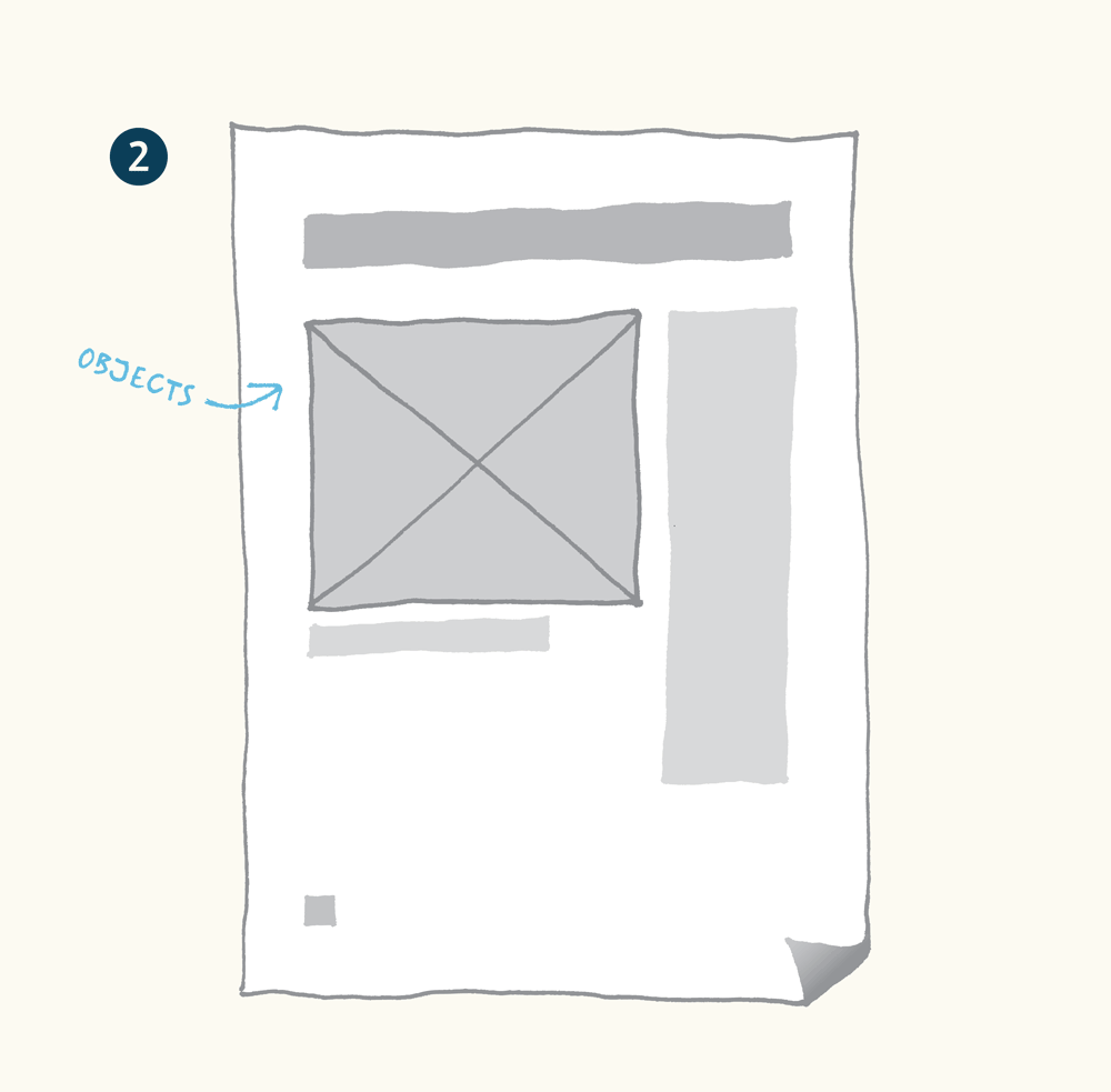
When a graphic designer approaches any kind of job we usually get a stack of pictures and a bunch of copy. After realizing what the physical format should be we start placing pictures, placing text and then we push these objects around until it looks good. Wether this happens on a grid or in the zero gravity conditions of an empty page is irrelevant for my story. Next we start fine-tuning the text. We chose a font and then mess around with size, tracking and leading. Every now and then it takes a print-out to see if our on-screen judgement of size and proportion holds water when it manifests itself on paper. This process works from the outside in, from big to small.Working from the page format inwards…
…by placing objects and moving them into place.
Invert the sequence
Now let’s turn this upside down and look at the process from a different angle. I propose that the body text is the beating heart of your design. Allow the laws of typographic design to be rooted in the rhythm of negative space, created by type. The letters are stealing white from the page and the remaining spaces interact with each other.The tiniest participant
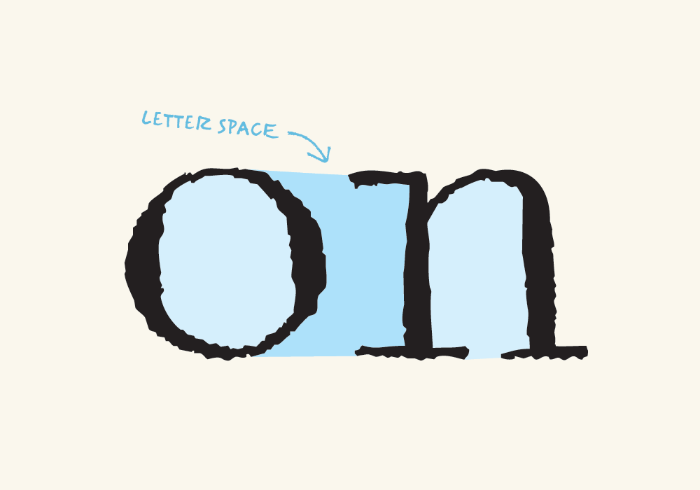
When designers think about typography they often imagine that the individual letter is the smallest unit in the text. But that is not actually true. Smaller than the letter is the counter, which is the aperture, the whitespace inside the letter. Type designers know that it’s all about the negative space around the letter shapes and not so much about the letters themselves.The white space inside the characters is called the counter.
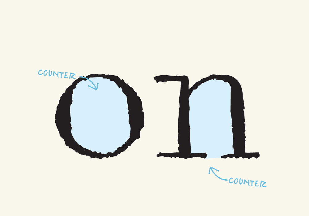
The space between characters is determined by the counters
Telling the next bigger guy what to do
To achieve a good typographic rhythm of shape and counter shape the space between the letters should be about as big as — or maybe just a little smaller than — the space inside the letters. So the space inside the letters determines the space between the letters. Or in other words, the counters determine the tracking.The apertures in a bold typeface are smaller than in a light style. That means that a bold weight has to be spaced much tighter than a light style. When objects are too close together it becomes hard to distinguish them. This is called crowding.
How big is a good size for the word space?
There is no one size that works for every font at any size. The letter-space is determined by the counters and the word spaces are determined by the letter space. If the word spacing is too small the words start sticking together and they become really hard to distinguish and to recognize. On the other hand, if the word spacing is too big, and there are giant gaps between the words, the flow of reading is disrupted. The reader’s eye has to leap from word to word. This relationship of proportions means that the bigger the letter spacing is, the bigger the word spacing has to be.Letter spacing determines the proper amount of word spacing.

Leading enforces horizontal integrity
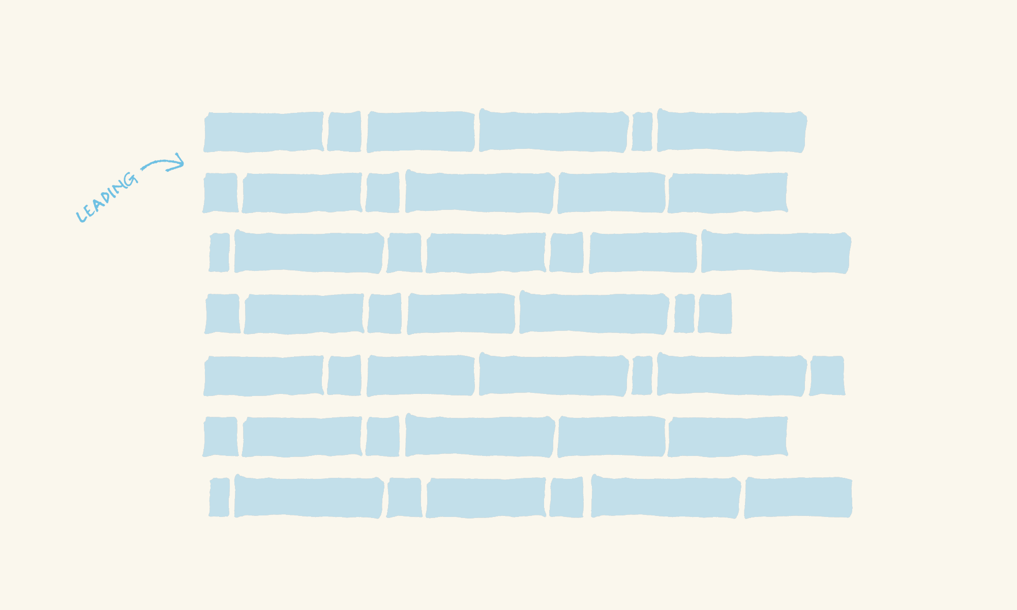
Roman scripts are read from left to right. That makes the horizontal relationship between neighboring words more important than the relationships between words that are in different lines of text, vertically on top of each other. The integrity of each line of text depends on enough space on top and bottom to keep the eye from accidentally jumping a line up or down. The reader experiences more difficulty tracking a line of text as the paragraph gets wider and its lines become longer. This means that longer lines need more leading.The space between lines of text is called leading.
That term refers back to the pieces of metal that printers used to stick in between lines of metal type.
Line length
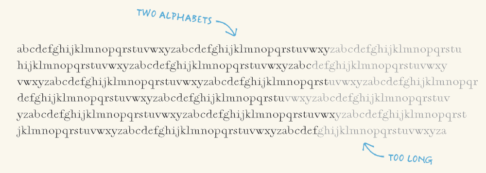
A good rule of thumb for an optimal line length is about two alphabets long (2 × 26 = 52 characters). As the lines get too long it becomes increasingly difficult to return the reader’s gaze from the end of the line to the beginning of the following line. That shift of the eye is a tiny disruption of the flow of reading. The typographer can mitigate this effect by adding a little extra leading. Longer lines seem to be less pleasant to read but tests have proven that reading speed actually picks up as line length increases.Shorter lines in turn, are disruptive to the reading flow. Imagine a line length of one single word. The reader would have to return to the beginning of the following line after every word. Instead of gliding through the text the reader’s inner voice would sort of spit out every single word in staccato. Narrow columns do have their place but they are only acceptable for relatively short pieces of text, newspaper typography comes to mind.
Growing the page around the text
Having proceeded from the smallest negative space, the counter up to the leading, each determined by its preceding, smaller unit we have arrived at the final mass of white space a text demands. The margins are a function of the space taken by the column. If the top margin was smaller or even equal to the gap between the first and the second line of text the first line would seem to have a closer relationship to the edge of the page than to its following line. The same is true for the last line and the bottom margin.At this point, having gazed at so many negative spaces and pondered the almost magnetic relationship between objects and between their counter spaces it seems evident that a column of text demands a certain amount of space around it not be crowded by the edge of the paper. The final, logical step in this process is to allow the typography to demand the size of the page, allow it to breathe on the page. If all the negative spaces on a page are proportioned respectfully of each other following the rule of the "inverse hierarchy" a simple page can evoke the sensation of a noble entity’s presence.
It seems elementary
Almost all of these little tidbits of typographic wisdom are pretty clear to everyone who has practiced a little typography. To me the surprising aspect here is putting dependencies into context. To realize that there is an inherent power structure, which if followed through consistently will reshape the design process.How long is the ideal line length
Count the letters in your copy. Even punctuation and the word spaces count. The typographer's rule of thumb says 52 (2 x 26) characters per line is ideal.
