.
Sep - 1997
A new glyph for the European currency
→ When the new, unified European currency was first introduced type designers all over the world scrambled to get their hands on workable character design standards and ways to technically implement the euro into the very limiting font technology existing at the time. This is a blog post I wrote in ’97, during that first wave when type designers basically invented the design principles of the euro on the basis of the meager and in part just plain faulty information that was publicly available then.
History – Birth of a Character
The genesis of the euro sign was documented faithfully by the creators themselves. Quoting the web site of The European Commission: <http://europa.eu.int/euro/html>...The symbol was created by the European Commission as part of its communications work for the single currency. Thirty or so drafts were drawn up internally. From these, ten were subjected to a qualitative assessment by the general public. Two designs emerged from the survey well ahead of the rest. It was from these two that President of the Commission, Jacques Santer, and the European Commissioner in charge of the euro, Yves-Thibault de Silguy made their final choice...
I always suspected that there is a democratic movement in type design. It seems that the shape of the euro was decided on by polling the Belgians. I am glad my dentist is quite a dictator and the construction of airplanes is not subject of the elective whims of some arbitrarily chosen public. If there is a process like the accumulation of skill and knowhow that puts people in the position to call themselves professionals it seems like The European Commission has chosen not to consult with that particular group of people. Personally I would estimate that there are not more than a hundred people worldwide that deserved to be put in charge of a design assignment like that. Wouldn't it be a scream if one of them worked at The European Commission?


The Shape – Logotype, Glyph and Character
Looking at the euro I suspect that at the heart of the matter lies a misunderstanding. It seems to me that the designer of this thing lacked some basic awareness of the differences between logotype, glyph and character.Glyphs are graphic shapes. Actual forms that represent a higher level concept of these forms. The "a" looks different in every typeface you look at and it looks different again when you write it yourself with a pen. And yet it is always recognizable as the "a". This concept of the "a" as one might call it is the character. The different shapes this character takes are called glyphs. The upright and the italic lowercase "a" from the same typeface are different glyphs. Yet the underlying character in both cases still is the same lowercase "a". A logotype is a unique shape (or combination of shapes) that represents a specific meaning. Like the yellow shell on a red background stands for a petroleum company. If you draw it the wrong way people might still get which company you meant but the original logotype tolerates only one specific shape as its own. You could say that a logotype is a single glyph character.
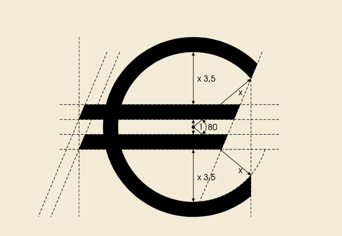
The design of the euro as supplied by The European Commission is a logotype. What they should have supplied was a character design standard.
Drawing
Many fonts won't have a euro added for years. So with the timetable for the monetary union in mind there is an urgent demand for customized fonts. But what should the euro look like? Numerals (1, 2, 3, ...) and currency symbols ($, €, £, ¢, ...) are part of a font just like the rest of the characters and the euro teams up with the existing monetary symbols. The euro symbol endorsed by the official euro site (downloadable as vector or bitmap graphic) really isn't a glyph. It's a logo. Like the star on the hood of a Mercedes. A precise description tells the type designer how to construct one of those euro symbols. The thing is, not all typefaces work like this. Actually only a very few do. If the euro is meant to work in text between other figures and characters it must follow the same rules. And those rules differ from one typeface to the other. So I am afraid that instead of downloading a nifty EPS and sticking that into just about every font that needs an euro it's back to looking and drawing.http://europa.eu.int/euro/html/dossiers/00203/html/index-EN.html
The official blueprint for constructing a euro-symbol.


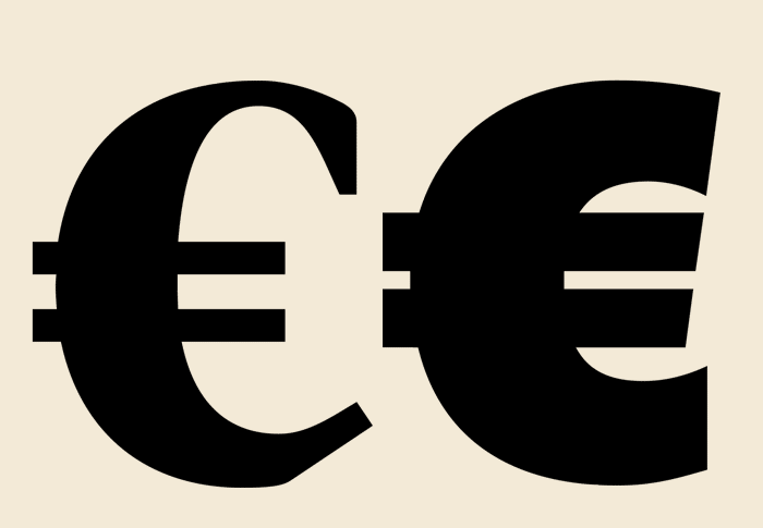
Now, that this doesn't work what else can I come up with? Here are a couple of basic rules that I discovered while drawing euros.
- Usually the C is a good place to start with. However, it is normally to wide (certainly if the euro is supposed to go with tabular monetary symbols ) and with the two horizontal bars added it will tend to become to heavy too. Another character that offers itself for comparison is the zero. No matter whether a typeface has lining or old style figures the euro should be similar in proportion and weight to the zero.
- I found however that very often the zero is not a very good starting-point for drawing the euro. The zero takes for historic reasons a very peculiar position in the character set. The development of the weight from thick to thin, the contrast, is normally lower or at least different in the zero than in the rest of the alphabet. - In an old style face the lower case c lends itself for a starting point.
- If you have to choose, for the sake of consistency the euro's weight, width, hight and overshoot should go with the other currency signs rather than with the numerals. In an ideal case (if you can start from scratch) I would choose to design currency signs and numerals matching.
- The terminals are something to keep an eye on too. In a lot of the classical text faces characters are equipped with serifs whereas the currency signs very often sport the tear ball terminals.
Even if you have the euro-logo inserted by a nifty utility it's still the same shape for all fonts. This utility even calls itself "EuroGlyph" unfortunately all it can give you is the logo.
The size of currency symbols
Oldstyle and lining figures each require appropriately sized currency glyphs. The same is true for the width of tabular or proportional width figures.

Denominations – Names and Abbreviations
Why is it, I ask myself, that everything created for the future Europe is baptized euro-something. A plausible answer might be that in a world where everything is typically local to one country or another the fact that there has been made an exception needs to be emphasized and honoured in the choice of the name. What might seem like a brilliant idea in a divided Europe becomes self evident and redundant, in a united Europe. This effect is comparable with the troubles people are facing with their businesses being called 2000-something. A launderette that goes by the name "Wash 'n Dry 2000" had a snazzy name to show off with in the fifties. The same old launderette will look terribly out-dated in the year 2001.Things that were called euro-... in good faith and with the best intentions are for instance the free-ways, additives in food and the weight of packed food, unleaded fuel,... I even spotted a sex shop called "euro sexy land".
The name euro is something we will have to live with. What about the spelling? The euro is to be written in lower case. That is true for all languages but German. In German the spelling will be "der Euro" for singular and "die Euro" for plural.
The existing PostScript names for "dollar", "yen", "sterling" and so on are all lower-case. In that context check out the revamped syntax for parseable PostScript glyph-naming algorithm.
<http://partners.adobe.com/supportservice/devrelations/typeforum/unicodegn.html>
Although the word is fairly short there seems to be a demand for a three-letter-abbreviation. For the euro this is "EUR".
Usage – Timeline of Introduction
From 1. january 1999 on money transfer in euros was made possible. The euro coins and bills hit the streets on 1. january 2002 (for Great Britain that will probably be 2005). Until 1. july 2002 you were able to pay with your local currency. From that day on the Dutch Florin and Deutsche Marks were good only to put up on the wall in a frame. Banks will still exchange them for euros another 30 years.The need to design old denominations (signs for pound sterling, florin etc.) will certainly be with us for a while though. Just because we don't pay in Deutsch Marks does not mean nobody will mention them in writing any more.