.
Feb - 2014
48h Neukölln
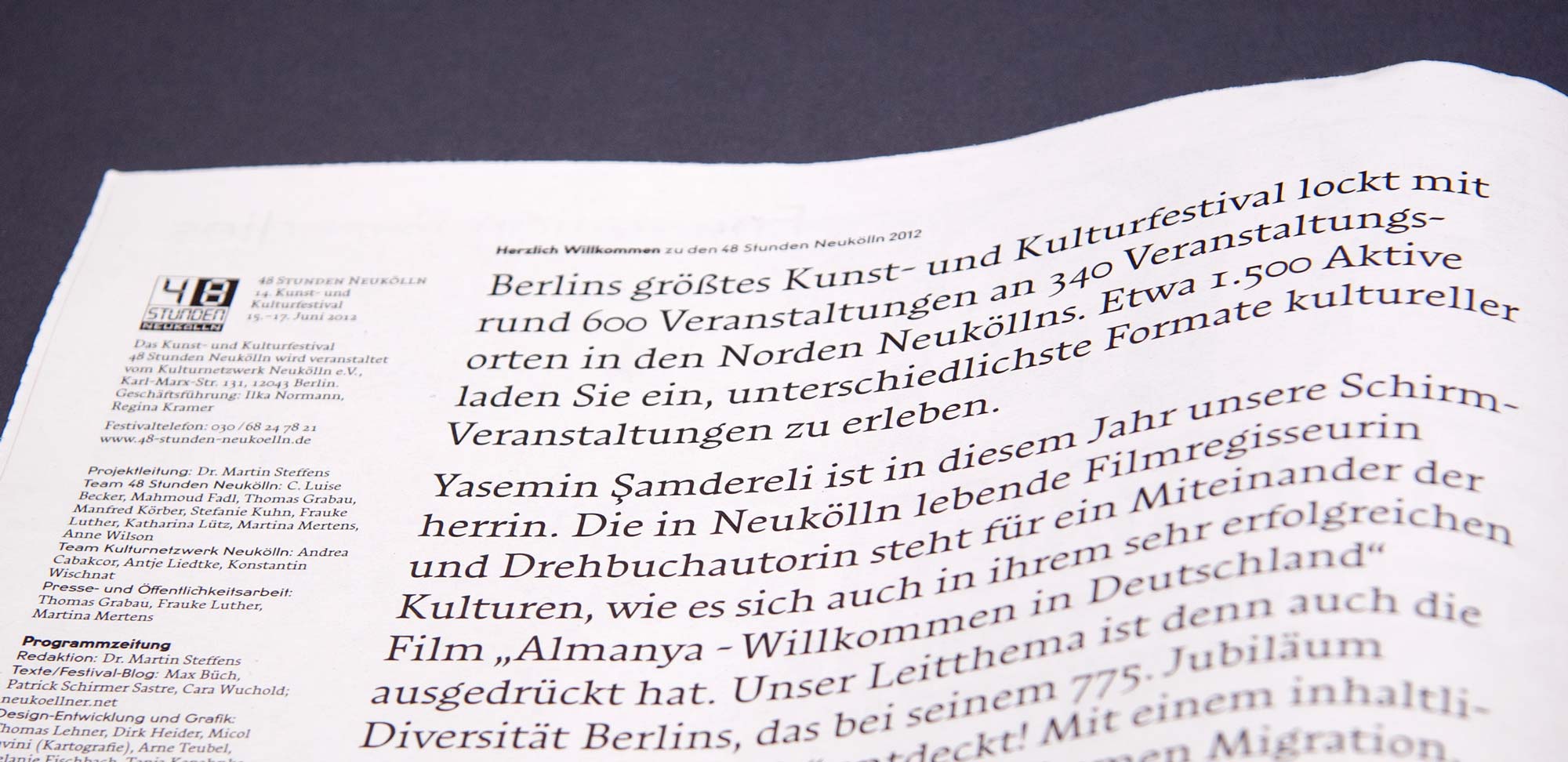
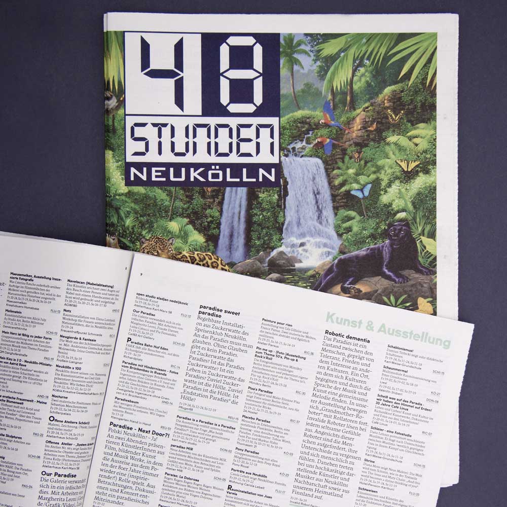
→ Berlin's biggest cultural festival, «48 Stunden Neukölln» features over 600 separate events on a single weekend in June. Two designers, Thomas Lehner and Dirk Heider, created a visual identity for this unique project by employing a custom style of Arouet, a family of typefaces that I hope to release with FamiraFonts in 2017.
A close view of the deck in Arouet-Neukölln on newsprint. Photograph with kind permission by Tanja Kapahnke, © 2012.
Update (06-15-2012): Slanted magazine reported about this project. Read more...
Creating the typeface
The choice of typeface for the editorial text as well as the event listings, fell on Arouet, which at that point was available to Thomas in an early beta version in three optical weights. But I had designed it with very small text in mind and Arouet was just a little too wide for the purpose the two designers had in mind. So Thomas approached me around Christmas and put the idea to create a narrow version of Arouet into my mind. Through the holidays I started drawing two very condensed masters. That way I would be able to interpolate any width in any optical weight.As time to design the program drew closer, Dirk and Thomas joined me in my studio for a day, and together we found the perfect combination of features in the type design of Arouet to serve their very specific purposes.
Typography, the visual expression of inherent structure
Thomas and Dirk tackled the task of making this enormous dataset completely transparent and accessible by choosing a real old school solution: tabloid format newsprint and hard core information design. The two Swiss educated designers analyzed, categorized, zoned, mapped, listed and illustrated the plentitude of events, locations and neighborhoods into an elegant, 32-page program.The designer's choice for a sans serif typeface fell on the U8, Anton Koovit's revival of typical 1920's Berlin subway signage, originally designed by the architect Alfred Grenander. Anton and I both happened to work freelance for Luc(as) de Groot at the time, which is a complete coincidence and just another one of these nice, small-world moments. Or as Camila would put it: "The world is a napkin" (#shoutOut).
Arouet type specimen

Arouet has four masters
This means that I drew four styles of the typeface: A Bold and a Light, each in Narrow and in Wide. Every font is an instance between those four masters, interpolated using the wonderful application Superpolator, created by Erik van Blokland. That way it is possible to meticulously determine the perfect visual weight and set width for a particular design job. It actually works very much like the old MultipleMaster technology. For the 48h job I established the two highlighted styles at the bottom in close collaboration with the two typographers.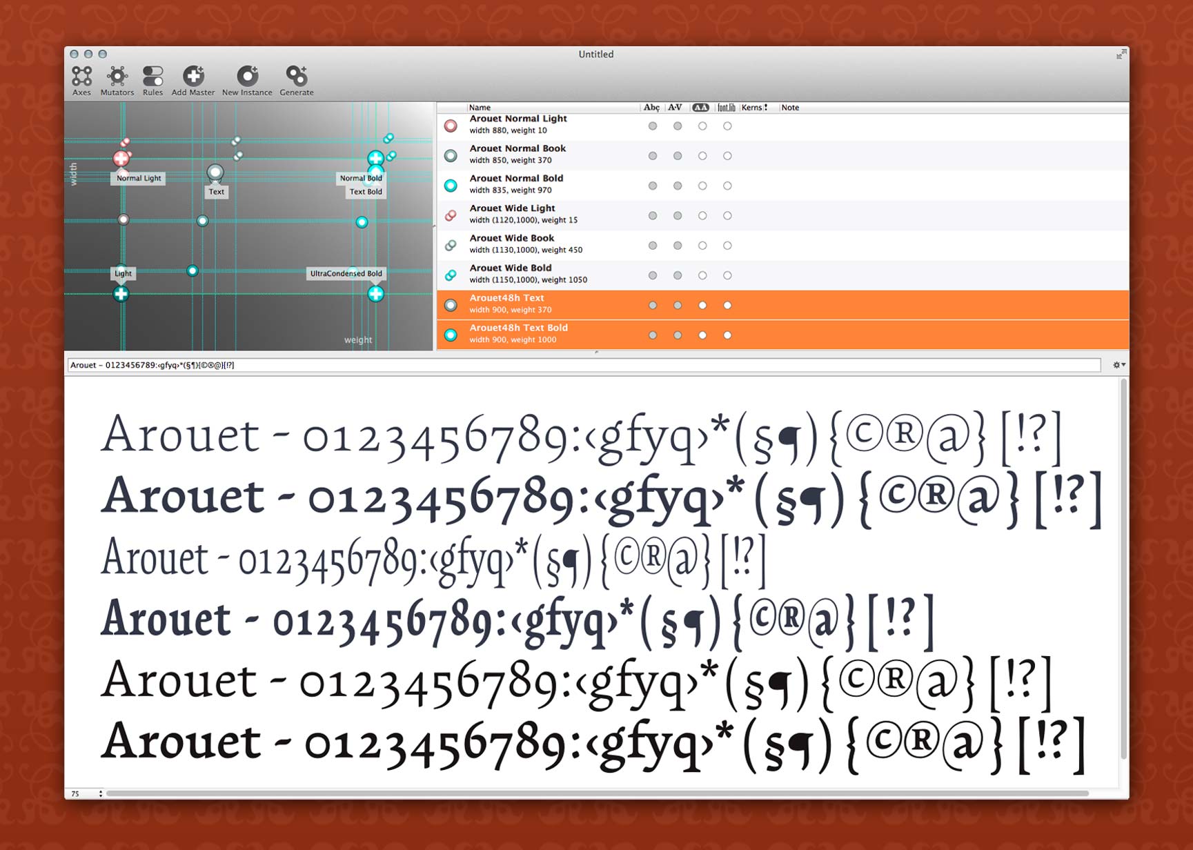
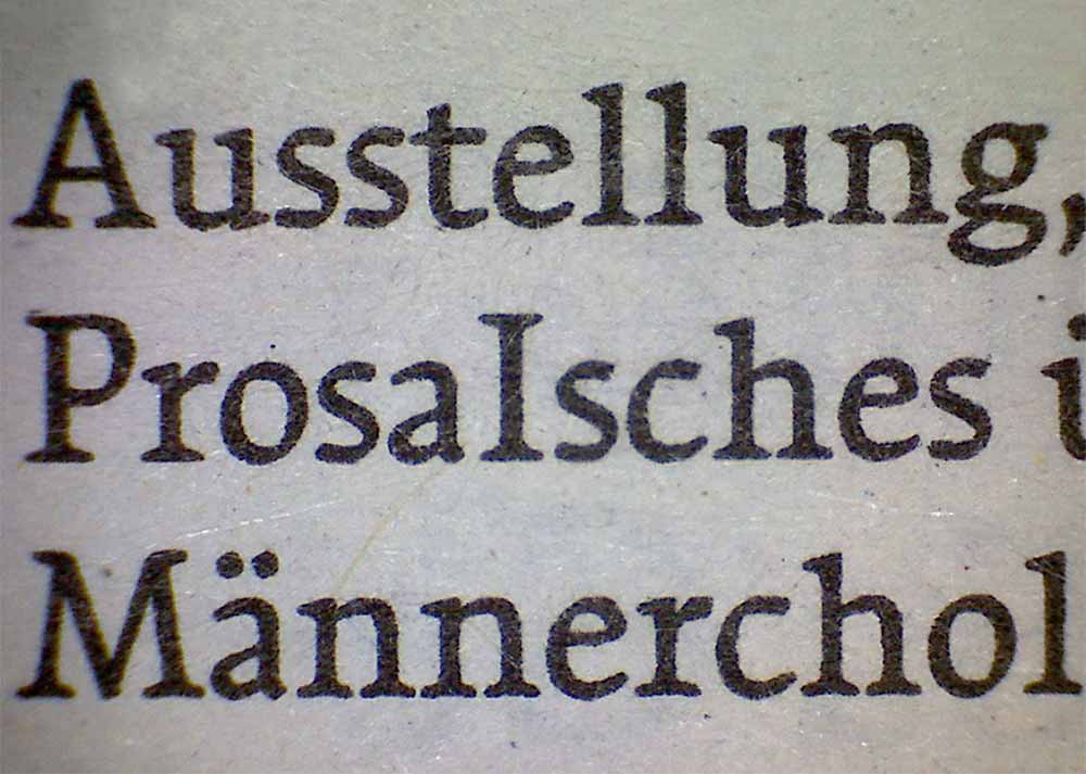
A microscopic view of the event schedule
7.5pt Arouet, offset on newsprint
The exhibition in the designer's work space.
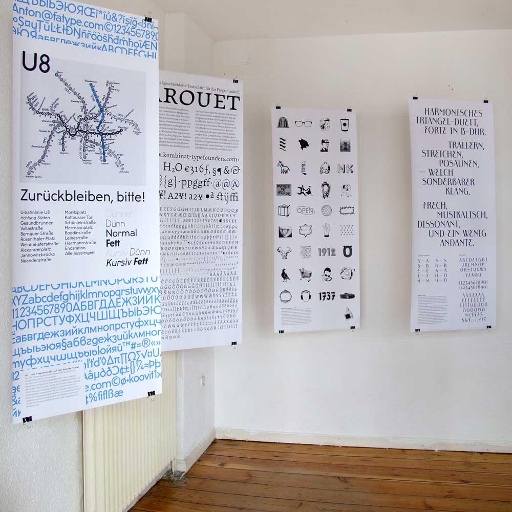
During the festival Thomas Lehner and Dirk Heider opened the doors of their workspace to the «48 Stunden Neukölln» public, presenting among other work, their design for the festival's program.
Who else was involved
client: Kulturnetzwerk Neukölln e.V., Dr. Martin Steffensproject management: Thomas Lehner (www.thomaslehner.com) and Dirk Heider (www.dirk-heider.de)
further contributors: Micol Favini (maps, www.micol.ch), Melanie Fischbach (www.fishcanswim.de), Tanja Kapahnke (www.kapahnke-rv.de) and Arne Teubel (www.guerillamedia.org)