.
Feb - 2014
Céline
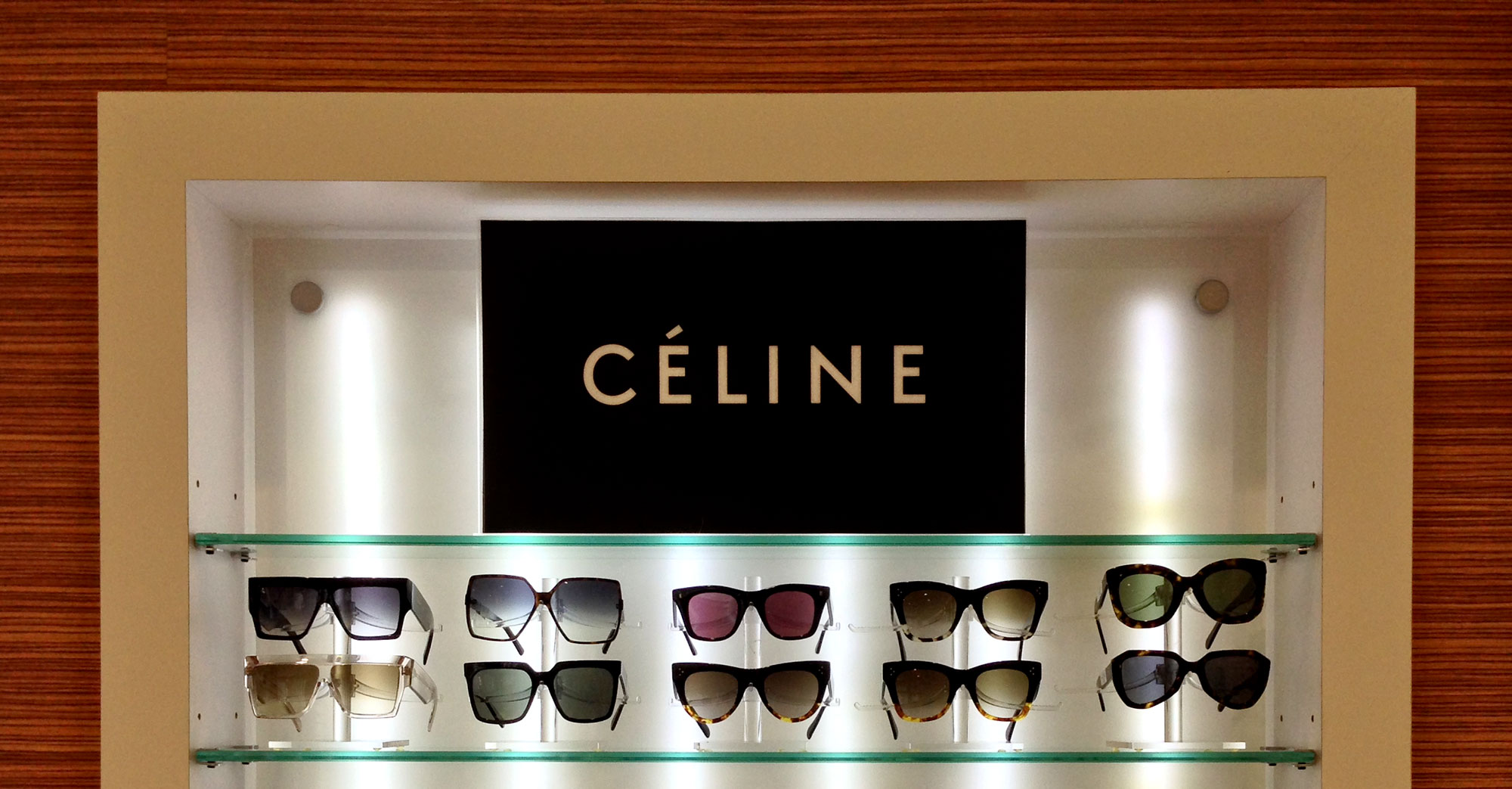
→ In 2005 I was commissioned by the Studio Peter Miles to create a custom typeface for the corporate design of the French fashion label Céline. It is based on a typeface called Semplicità (1931), created for the Fonderia Nebiolo by Italian type designer Alessandro Butti, the head of the foundry’s Studio Artistico.

Update: Laura Bradley of AnOther magazine takes a good look at the Celine logo in her article from July 27, 2014, called #WordWeek: Five Favourite Fashion Logos.
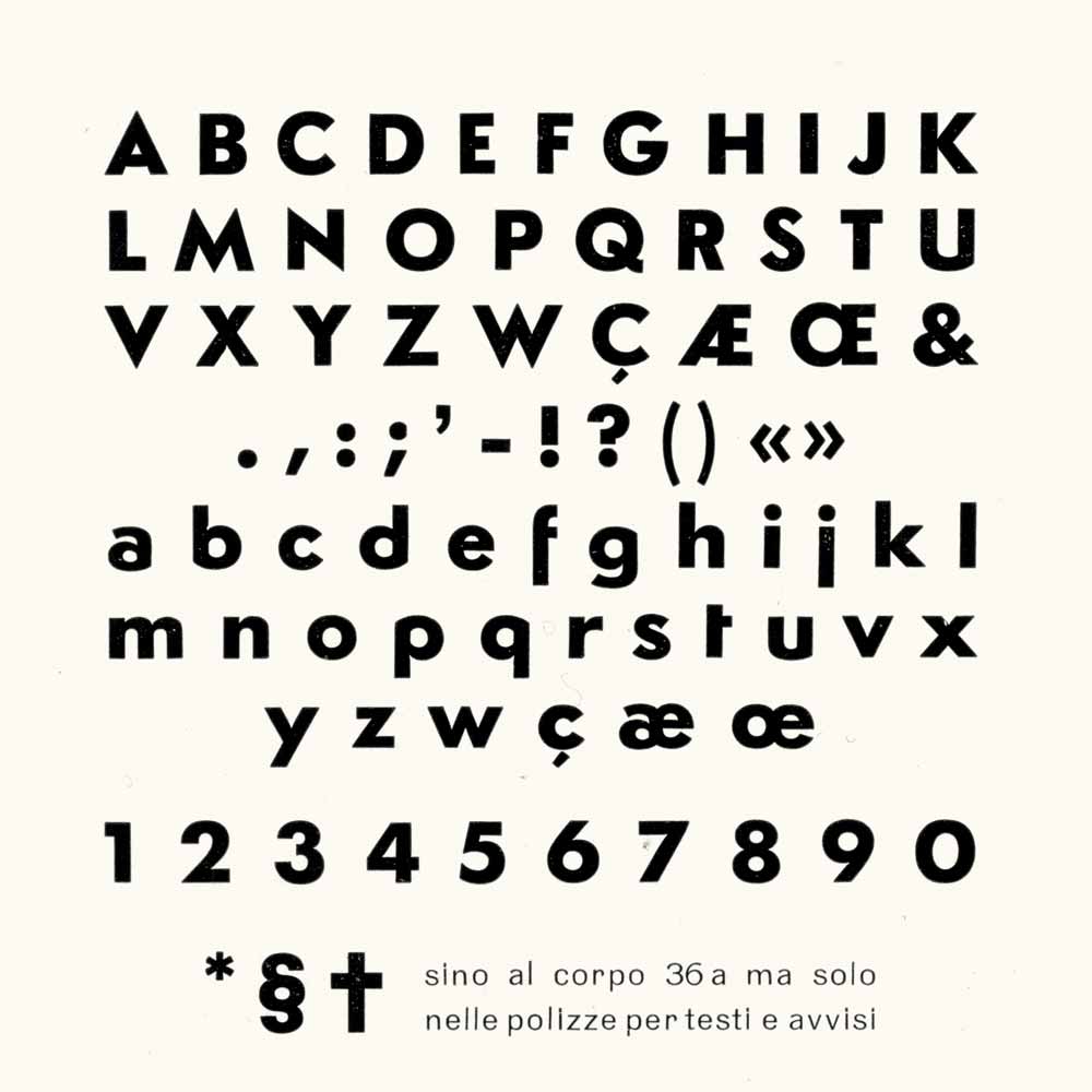
The original type specimen page 36pt Semplicità
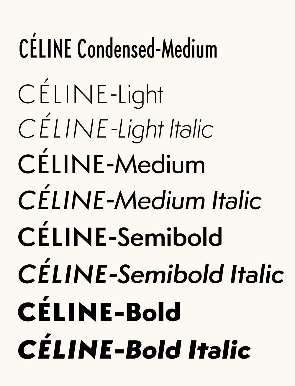
All styles of the new corporate font
“Semplicità was the most popular sans serif in Italy during the Fascist era, but it is little known outside of the country. The interwar sans serifs all have geometry at their core but they range from Euclidean severity to Art Deco frivolity. Semplicità is closer to the first pole but not as much so as Futura.”
— Paul Shaw in Overlooked Typefaces at Imprint, February 10, 2011
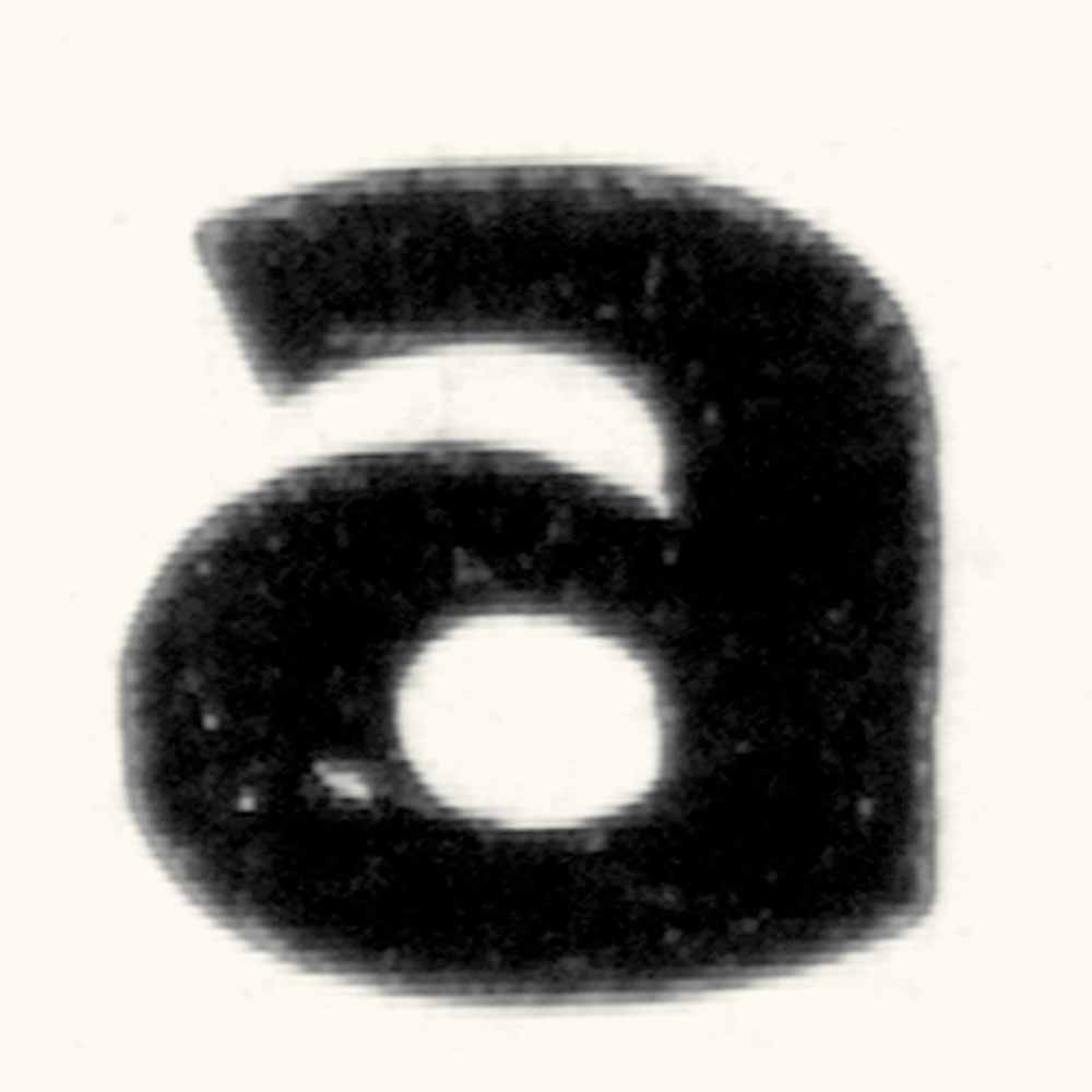
Following an initial conversation Peter sent me a number of scans of the original metal type specimens pages. While the resolution was great for the entire specimens page, when zoomed in to the individual character it turned out to be quite course for the intended purpose. But after some initial bellyaching I quickly realized how fortunate I was that there were no higher resolution scans available as this provided me with some considerable room for interpretation. After all, the translation from the original to the revival is where the fun lies.
Metal type detail
This scan of the 36pt Semplicità specimens page shows the original resolution
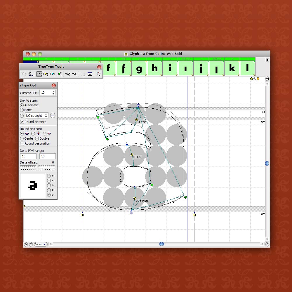
Hinting
Manually hinted web fonts for a seamless integration of screen based media
The digital font was to serve in print as well as on screen in all sizes, ranging form the small print to store signs. The originals however were cut for 36pt. letterpress and contained visual corrections that tailored the letterforms specifically to this one particular text size, anticipating ink spread. Many proved too extreme for larger sizes and I had to tune them back considerably.
The weights of the styles of Semplicità went from quite light to very heavy causing thick-thin contrast issues for the interpolated instances. So I decided to make visual corrections in the Semibold style and re-insert it as an in-between master. The third leg delivered an interpolation with the desired, subtle transitions of weight and contrast between Light and Bold.

A visit to the store
