.
May - 2015
The Helmut Lang Logotype
→ In the spring of 2015 Korey Vincent, who was working for Helmut Lang sent me extensive documentation on their corporate identity's evolution and suggested that I have a look at their current word mark. The changes I proposed resonated so well with the Helmut Lang team that we decided to embark on a thorough reimagining of the logo.

Research
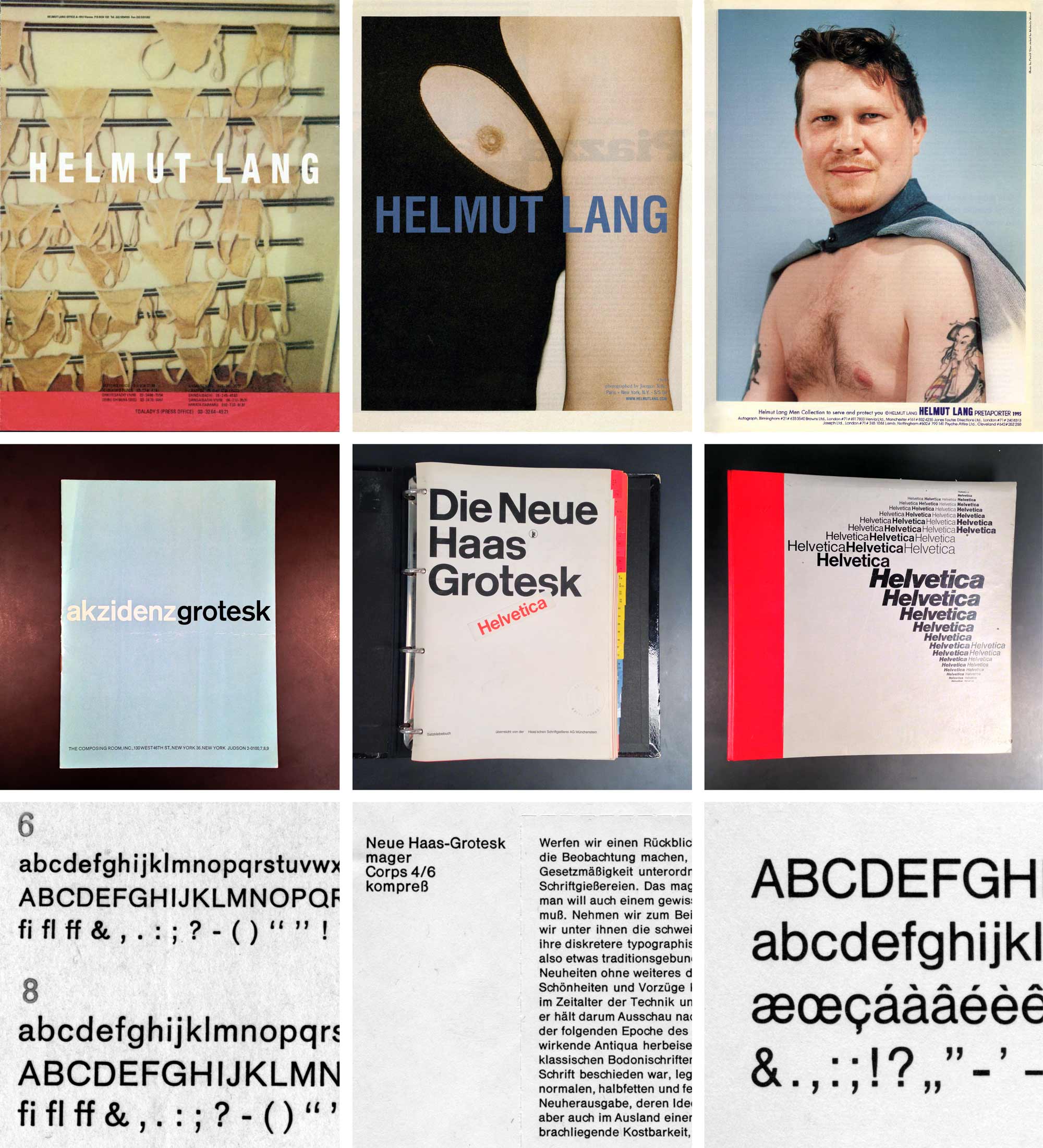
Looking through the documentation made available to me I identified a number of characteristic features that seemed vital to evoke a sense of familiarity in the new logo. It seemed that regardless of all the changes the logo had experienced through time it had always been a narrow, heavy sans serif in all caps with expansion contrast. So I decided to research the particular sliver of iconic, early grotesk metal typefaces that epitomize these attributes.I visited the Herb Lubalin Study Center at the Cooper Union and with the help of the curator Alexander Tochilovsky found original letterpress specimens of early versions of three closely related typefaces Akzidens Grotesk, Haas Unica and Helvetica. The cuts for the smallest optical sizes promised to carry most of the quirks I was hoping for. In the times of letterpress printing letterforms were adapted for specific sizes to compensate for irregularities caused by ink spread, poor paper quality and the general differences in the human perception of type in different sizes. I was hoping that these visual adjustments would add a pinch of subversive spice to letter shapes which were originally designed for a modernist, "neutral" appearance.
Interpolation as design tool
The classical method for this kind of design work is to draw a bunch of competing logos, select different directions and then to tweak and refine these, eliminating the weakest alternative at every iteration. I decided to reinvent the road we would travel and let the computer do the leg work.The idea was that I would digitize the letters for the Helmut Lang logo off of every single one of the three letterpress specimens in a manner that would allow me to interpolate between them. Traditionally the type designer would digitize a Light master and a Bold master and then use interpolation to automatically generate the in-between weights (referred to as instances) Book, Medium and Semibold. While interpolation is mainly used as production technology I realized that in this particular case it could serve me as a design tool to explore and visualize possible variations in shape, implied by the masters. This way we would be able to harvest an unlimited number of different weights of a new typeface that would be a perfect blend between all three, classic typefaces. We would be able to regulate with decimal precision to what degree it would reflect the specific appearance of any of the three master typefaces. This would allow us to simply select favorites from amongst a boatload of automatically generated results. At least that is what I had planned…

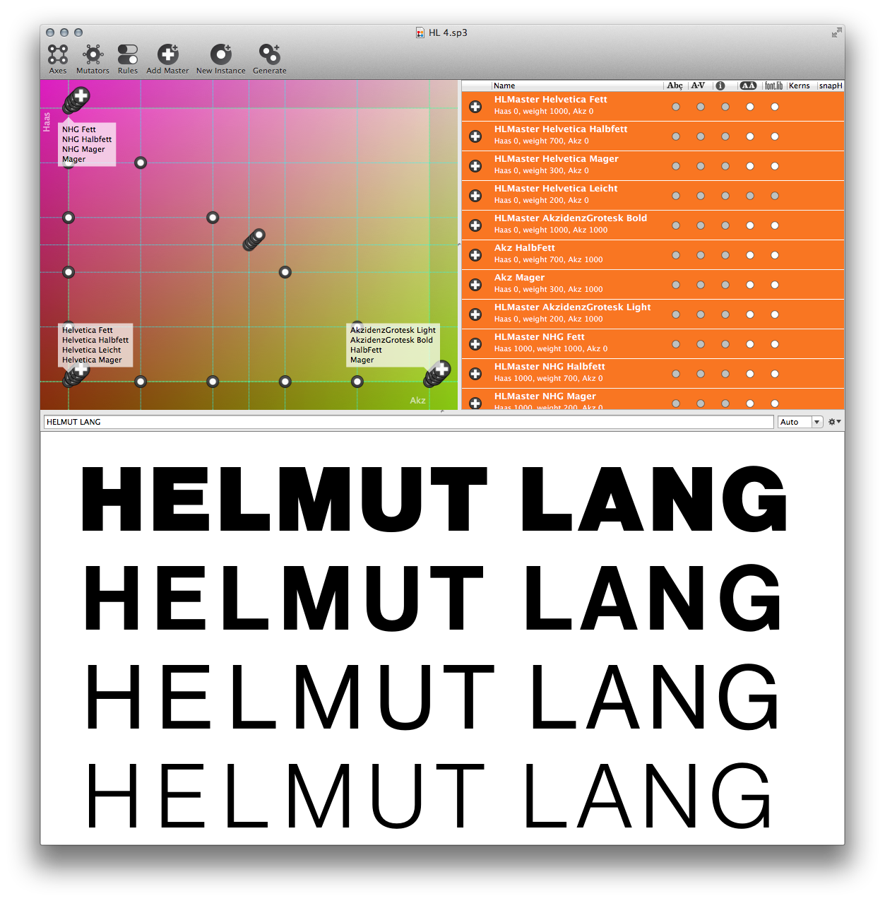
It turned out though that my three source typefaces are so similar in shape and appearance that the design space defined between them simply presented as a very generic grotesk without any noticeable variation in character. This is actually what I had hoped for as a general starting point for the logo design, a typeface somehow resembling any of the sources but unlike any of them in the details. In practice however it was disappointing how precious little diversity in shape my genius plan offered. I called the in-between fonts Akzivetica, Haasivetica and Akzihaas. I should have seen this coming, the interpolation changed only very slightly along the axes defined by the three sources. They were indistinguishable.
Phase II - picking a logo
Once I had overcome the surprise and disappointment the generic nature of any of the instances between my three masters turned out to form a beautiful starting point for what I called Phase II. The logo font was no longer distinctly recognizable as any of the tree original typefaces. So I drew light and heavy versions to serve as interpolation masters for a weight axis as well as high-contrast versions in both weights.
Now this made a big difference and the instances resulting from this new interpolation started looking really fresh. With an added width axis I had finally succeeded in creating a really fertile playing ground for our hunt for the new Helmut Lang logo. I interpolated 245 instances (seven weights, every weight in a range of seven steps of thick-thin contrast and all of that in five widths). We looked at each of the 245 logo fonts in four different tracking settings. This put us in the luxurious position that we could simply pick one out of the 980 logo variations that had the pure and iconic essence of the classic Helmut Lang logo without actually resembling any previous incarnation.

Refinement
Once we had isolated a winner the fine tuning started. So far the character shapes were actually just a generic interpolation between the three historical letterpress typefaces. In Phase III I very carefully adjusted the width of glyphs in relation to each other, fine tuned individual stroke thickness and reviewed the expression in the curves.
Small sizes and low resolution
Many of the applications in which the logo finds use are either quite small, like on garment tags or have very low resolution like in cases where it is embroidered or used on screen. For screen I created a manually hinted TruetType version of the logo font with slightly adjusted spacing, pictured below on the right.
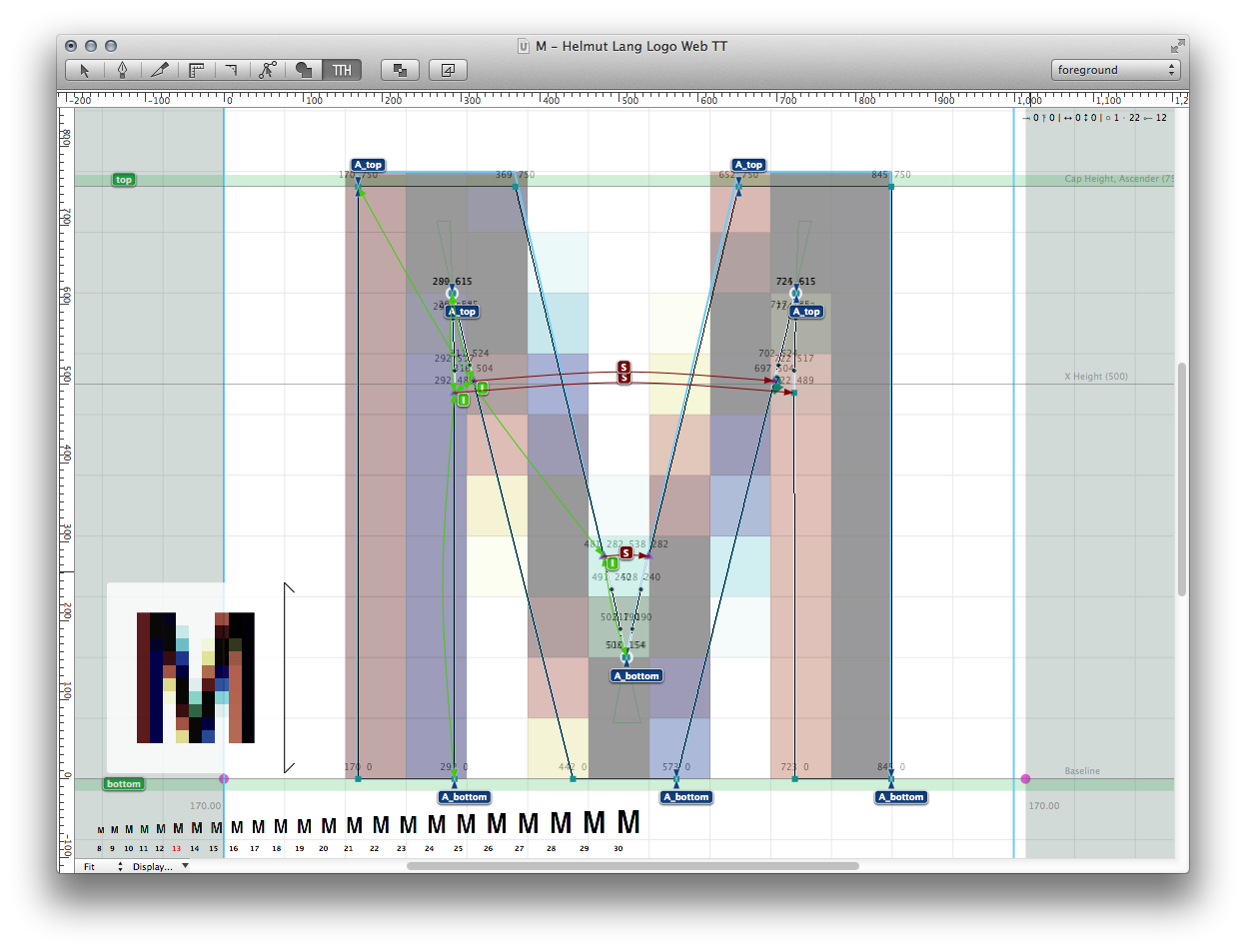
For use in very small sizes I created a separate logo font containing letterforms that are visually compensating for scale. Shown above on the left, on a black background are those glyphs where the changes in the outline drawings are most evident. All glyphs are more generously spaced and drawn a little wider showing a pronounced variation in stem thickness. An example for the exaggerated thick-thin contrast in the branchings is the arch at the bottom of the G which is pinched just before it joins the vertical stem on its right. The color of stroke connections is optimized through use of generous ink traps.
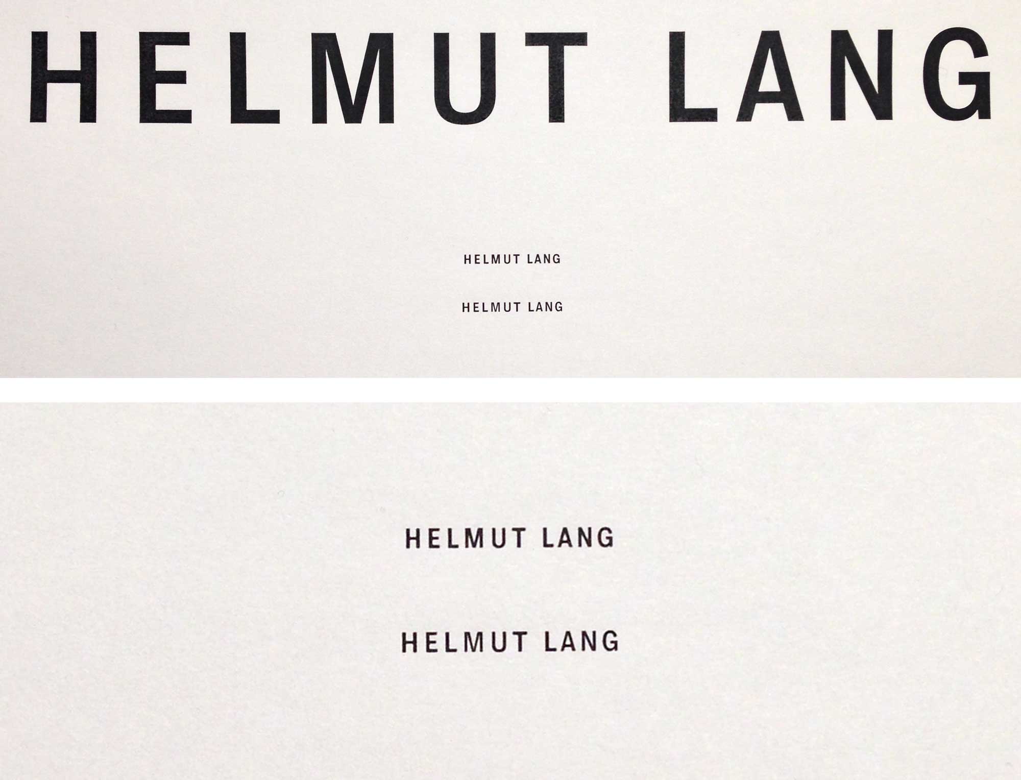
Pictured below is a photograph of the regular logo version in large size. Then below, in 7pt small is the same version alongside the size optimized alternate drawing. The picture at the bottom is a closeup of the same 7pt comparison of the Regular and the Petite versions of the Helmut Lang logo font.
Pictured below is a photograph of the regular logo version in large size. Then below, in 7pt small is the same version alongside the size optimized alternate drawing. The picture at the bottom is a closeup of the same 7pt comparison of the Regular and the Petite versions of the Helmut Lang logo font.
My very special thanks goes to my wonderful accomplice Javier Viramontes for helping to digitize the source fonts, creating the first round of interpolation masters and a kickass presentation for our client. Erik van Blockland the creator of Superpolator deserves an extra shout-out for talking me through a particular knot in my thinking. Korey Vincent, Christine Corey and Stephanie Prepon Drengk at Helmut Lang for their inspiring collaboration. Alexander Tochilovsky for his knowledge, patience and dedication in helping me research the source material at the The Herb Lubalin Study Center of Design and Typography. Finally my thanks goes out to Helmut Lang for graciously making the images on this page available depicting the old ad campaigns as well as the new logo in use. These images are © copyright by Helmut Lang LLC.