.
Mar - 2014
In de Knoei
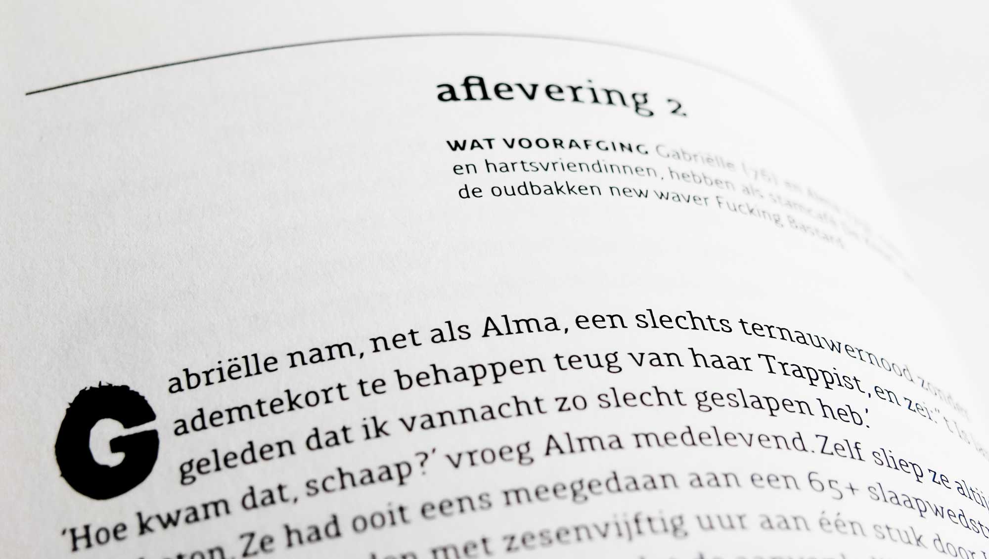
→ At the occasion of the company's tenth anniversary the consulting firm Eprom commissioned the Belgian author Herman Brusselmans — who enjoys a rather spectacular reputation — to write a novel, published in a very limited edition of 300 copies. Jeroen Schmit designed the cover and I created the typographic concept in 2002.

Set in 1998 Gabrielle and Alma, two best friends in their late seventies, who are recently widowed are hanging out at De Knoei (The Mess), their local cafe which is run by the old school new-waver “Fucking Bastard”. As the events unfold they increasingly run out of hand. Fueled by many Trappist beers the two elderly ladies discover weed, get tattoos and eventually have a threesome with their favorite barkeep.
The typographic concept
The story follows a rhythm of short, numbered chapters, each preceded by “what happened so far” and followed by “read next” summaries, reminiscent of the episodical structure of the stories found in magazines. This proved to be a very interesting challenge for the typographic concept.Starting from the optimal text size I created a grid based on a smallest unit of 3 millimeters. I made sure the base line grids for the copy, the chapter titles and the synopsis paragraphs hooked into each other in a meaningful way. I often find the grid the most enjoyable part of any typographic job, like math for arithmetically challenged kids. It is a special satisfaction when the grid is so tight you hear the air escape. The better a grid is, the more freedom it will afford the designer. So I know it is loo loose if it encumbers my design decisions. This one worked just fine.

I chose my slab serif Interpol Serif for the copy. The Interpol Serif started as part of my graduation project at the kabk, the Royal Academy of Fine Arts in Den Haag in the summer of 1992. Its design examines a number of issues:
- How low is the contrast between the thinnest and the most prominent parts in a character that tolerates serifs but will do equally well without them.
- What happens to the shape of medium weight characters when they are the result of an interpolation (hence the name "Interpol") between two extreme weights like a really bold and a really thin typeface. Or rather: what needs to be done to the extremes in order to produce functional, interpolated middle weights.
- What really is the succession of weights that will appear the most linear to the readers eye.

The drop caps come out of one of my very early typefaces, the JCTieshy, which is part of the Jetsam Collection. The decayed letter shapes express the gradual decline and inevitable demise of the story’s heroines quite nicely.
