.
Feb - 2014
Moving card
→ In 2005, the first time I moved to New York City, I announced my change of address with this little card. I made the illustration and I drew a custom typeface for it.

I drew the original illustration with beziers directly in Adobe Illustrator. To match the style of the drawing I wanted the text to look like it was just written by hand. Unfortunately I am a terrible calligrapher.
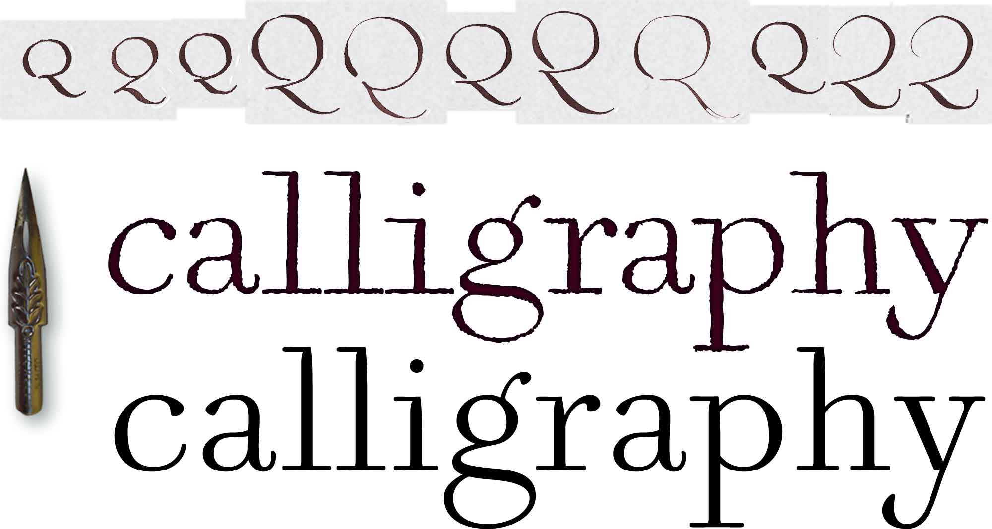
So I wrote a number of variations for every character using a dip pen with a pointed nib. I digitized the letterforms and then copied them into a font. The wobbly auto trace of the written forms has all the little wrinkles and blobs that are caused by the interplay between ink and paper, which I find perfect for the purpose. After all I wanted the card to have a distinctly handcrafted look.

I liked the character shapes of the resulting typeface so much that I started cleaning up the outlines and slowly it started to turn into a new project. I named the cleaned up type Eady OldSchool. At this point it is still very much a work in progress and I think I went too far in tidying up the shapes. The stress has shifted a little too much into the vertical which makes Eady OldSchool lose some of its charm. There is much work to be done here.
