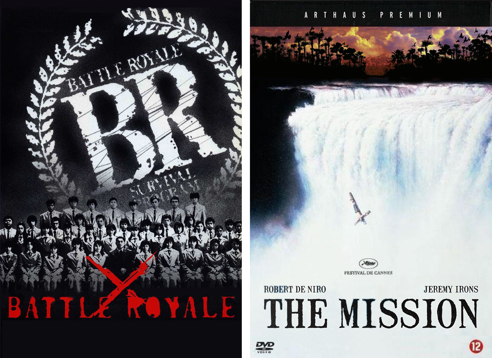
.
Jul - 1994
My first typeface ffMutilated
→ One of the great joys in a type designer’s life is when one discovers one of our creations in the wild, in action so to speak. When some graphic designer uses our font and demonstrates how our type design can function in the context of graphic design.
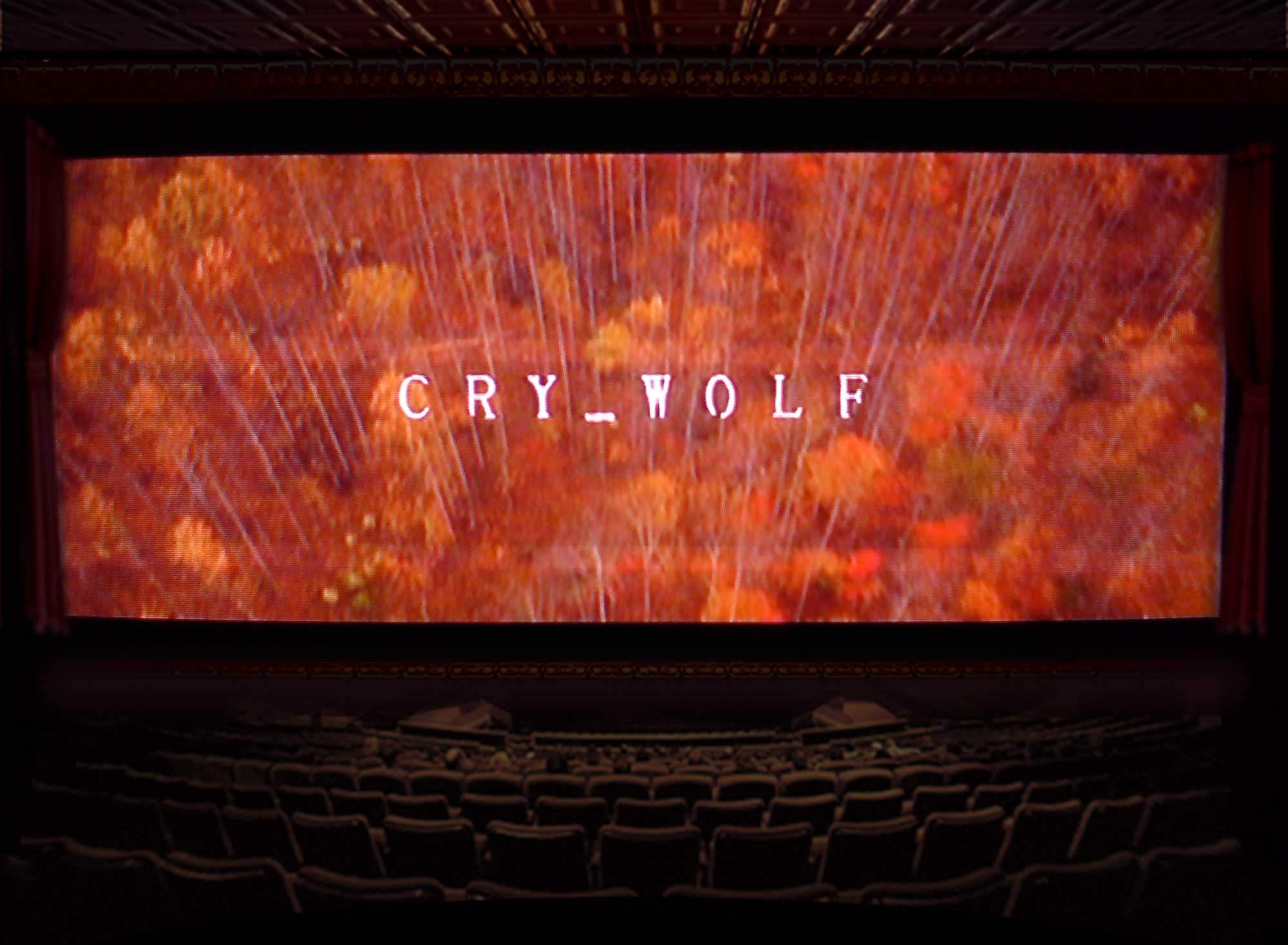
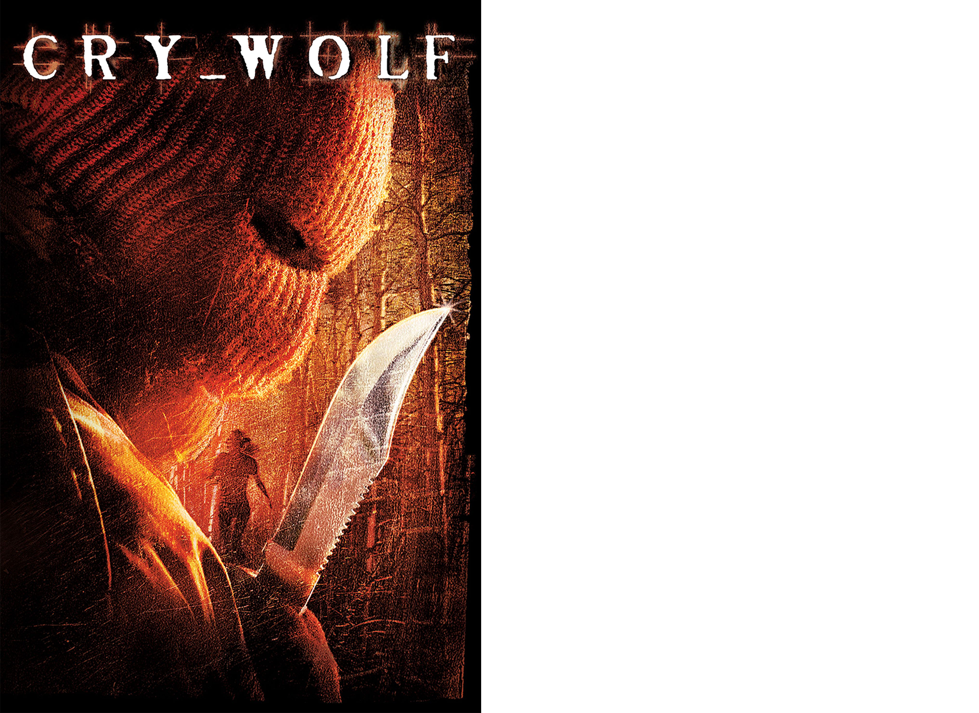
The titles and production design of Cry Wolf is one of these cases. The typeface used here is called ffMutilated and is one of the first fonts I created way back in my first year in art school. It was released with FontShop in 1994 and sold since in the DirtyFaces bundle No. 4. Of course it is only simple logic that the longer a font has been commercially available the bigger its proliferation will be. So although the ffMutilated probably won't rank amongst my proudest moments as a type designer it is still very usable and I am happy every time it pops up somewhere.
So I bought the Cry Wolf soundtrack and the DVD purely for the cover but then had to discover that the movie is not half bad even if you are not a particular fan of the teen-slasher-mystery genre and the soundtrack totally kicks ass!
Cry Wolf homepage and IMDB (US box office: $10,042,266)
Becca Leitman - art direction, Cole Gerst - CD cover design
LargeLab - Titles & Graphics
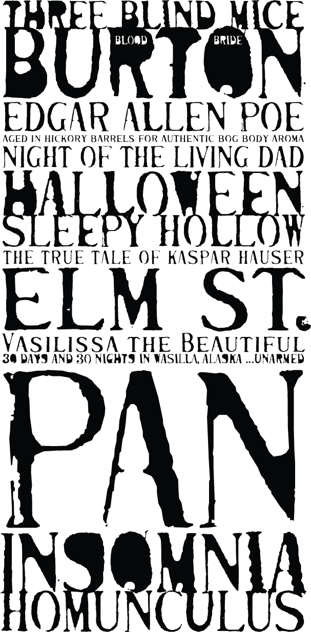
The fonts included in the ffMutilated bundle are the PlainCaps and the Fat. This specimens is a showing of these two weights.
The original text for the ReadMe file that was shipped with the fonts
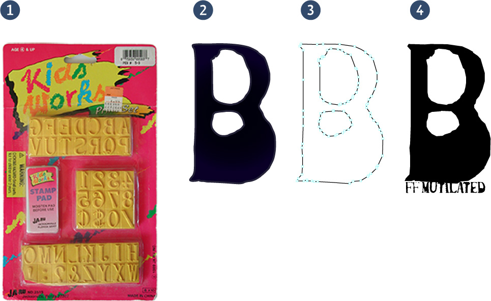
“The lettershapes are taken from little rubber stamps I found in the toy department of a supermarket. I printed them with Chinese ink on rough paper, digitized them and built a range of five weights out of them. The two weights included in this package are FF Mutilated™ Plain Caps and FF Mutilated™ Fat. Both are capitals-only fonts. The lower case keys of the Fat version give access to a rather plain and clean alphabet, identical to the caracterset FF Mutilated™ Plain Caps features under the caps. The lower case keys of the Plain Caps font provide the small caps and the capital keys of the Fat version features a set of extremely overweight, ink smothered capitals. So what you actually have to your disposal are three fonts that hide under the keys of two, which comes in handy when used in text in applications that allow you to change the case of selected text. With the FF Mutilated family you don't actually change the typeface's case, instead you toggle between degrees of mutilation.”
The rubber stamps I used are still covered in dried up ink and live in an old Earl Grey box somewhere at the bottom of a drawer but I found this identical stamp set in Boston a few years later.
The original font had five styles of which FontShop licensed two. I know... looking at it here it kind of begs to be updated and integrated into three OpenType fonts.
2) Make imprints
3) Vectorize (back in the day using Adobe Streamline)
4) Stick the outlines in a font (using RoboFog)
The original font had five styles of which FontShop licensed two. I know... looking at it here it kind of begs to be updated and integrated into three OpenType fonts.
The four steps of digitizing the ffMutilated
1) Buy the rubber stamps2) Make imprints
3) Vectorize (back in the day using Adobe Streamline)
4) Stick the outlines in a font (using RoboFog)
Edgar Allen Poe
This wonderful book was designed by Susie Bikle of Studio Zipper in her student days.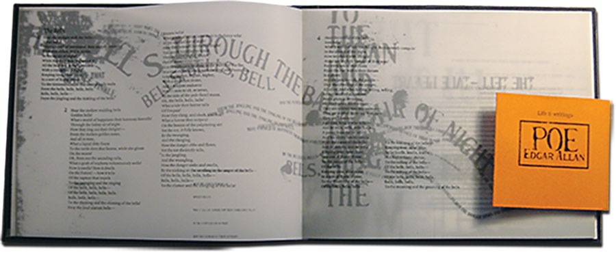
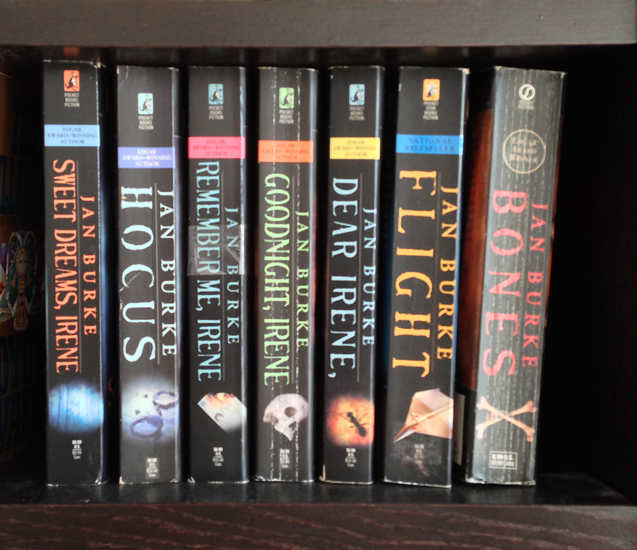
Jan Burke
Another application of the typeface ffMutilated, the cover design of Jan Burke's Irene franchise books:
Los Condenados movie poster (The Condemned)
Thanks to Ives Peters for spotting these poster designs by Cardinal Communications and reviewing them in his column on the FontFeed:"The posters for Los Condenados (The Condemned) are a typographic throwback to the mid-nineties. Deconstructivism and the related grunge style was in full swing, with foundries like GarageFonts established in 1993, primarily as a vehicle to distribute the typefaces used in the legendary Ray Gun magazine, and Carlos and Sun Segura’s T-26 promoting the grunge aesthetic. In 1994 FontFont launched its own line called FF Dirty Faces. One of my favourite designs in this collection was Hannes Famira’s burnt-looking FF Mutilated, which makes an appearance on this poster. Its letter shapes were taken from little rubber stamps found in the toy department of a supermarket. Hannes printed them with Chinese ink on rough paper, digitised them and built a range of five weights out of them, two of which were licensed by FontFont. The glowing effect applied to the type on this alternate poster is very appropriate. The characteristic texture of the character outlines makes them appear as if they melted or burned down. I don’t know which technique was used here, but I once developed my own, explained in this Glowing Letters tutorial."
— Ives Peters
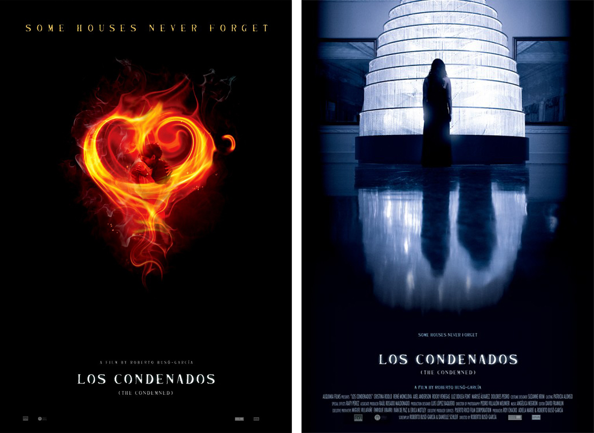
The movie’s official facebook page: <www.facebook.com/CondemnedFilm>.
Order the DVD on Amazon.
Battle Royale
Yet another movie poster for what is looking like an awesome martial arts movie.