.
Feb - 2014
GAK Symbols
→ I drew this set of symbols for the Dutch department of labour’s way finding system during my time at Studio Dumbar. They were enameled onto metal signs and found use in the job-center buildings of the GAK all over the Netherlands.

The drawing
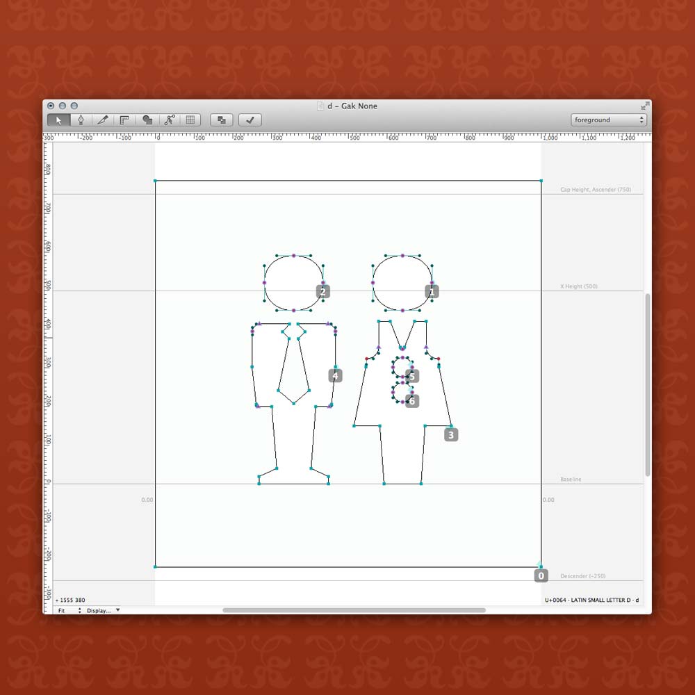
The symbols are drawn like a typeface and stored in a font

The starting point for these symbols was the new corporate identity, created by Studio Dumbar. Just van Rossum was in the final stages of drawing a corporate typeface for this project. To tie the symbols in with the font, used all over the buildings I recycled the dot on the letter i from the Bold style as the head of my bathroom man and woman. The buttons on her dress are scaled down versions of it too. That charming, slightly squared out circle was a great toehold for the visual language for the rest of the shapes. It was important to me that these symbols would convey a human, friendly spirit and be charming without seeming comical. I thought, when you are waiting at the unemployment office you want a friendly smile and not being laughed at.

This work is shown with kind permission and is copyright © by Studio Dumbar.