.
Nov - 2014
The letter proof, testing step-by-step
→ The proof document is a multi-page piece of typography, created to visually explain a font in every detail to the type designer themselves. Its nature is educational and it communicates the most critical kind of affection that a designer can have for their own work. It aims to reveal a typeface’s weaknesses.

Jump to one of the sections below
Perception is a tricky thing. Humans are conditioned to look at the same object in different circumstances, sunset or noon, close by or far away, and realize that what they are studying is in fact one and the same object. When a type designer creates letterforms it is crucial to disable this internal arbiter and specifically focus on the distinct differences in appearance that a typeface offers in different situations. The proof document is designed to present the most complete set of circumstances and reveal all aspects and flaws of a typeface.
- Format and layout
- Page header
- Proof text
- Character set
- Symbols
- Presentation
Purpose
When I start designing a typeface either from scratch or from an historic source there are a number of steps to take, some of which may be skipped. Proofing my work on paper however is essential. Having worked for a number of type foundries I have had the opportunity to absorb best practices of some of the most inspiring and experienced designers. Every type designer refines their proof document throughout the years and it grows from project to project into a highly refined and often proprietary tool. I distilled these experiences into my own workflow and I have added to them. This should give you a solid starting point to create your own type proofing document.Perception is a tricky thing. Humans are conditioned to look at the same object in different circumstances, sunset or noon, close by or far away, and realize that what they are studying is in fact one and the same object. When a type designer creates letterforms it is crucial to disable this internal arbiter and specifically focus on the distinct differences in appearance that a typeface offers in different situations. The proof document is designed to present the most complete set of circumstances and reveal all aspects and flaws of a typeface.
Method
The proof document has a number of different parts, each designed to focus the designer’s attention on a certain aspect of the font. The following are some practical steps in setting up such a document. Depending on the printer at your disposal crate a US letter or tabloid sized InDesign document in landscape format.Page layout
Generous margins will isolate a text from the page's edges and bring it to life. This negative space around a paragraph should be proportional to the negative space inside a paragraph such as tracking, word spaces and leading. Use your taste and intuition to figure out how much margin the text on your page needs. Try different size margins and print them out. Here are more thoughts on the hierarchy of space in typography.Style sheets
The typographer in you will itch to make adjustments to the pages but wherever you can make sure to use paragraph style sheets instead of applying local typographic fixes. By paragraph style sheets I mean the Paragraph Styles in InDesign (to be found under the menu "Type" or the function key F11). So select the text, create a paragraph style. Then don't create typography by adjusting the text on the page again but instead edit the paragraph style and watch the text on the page change. Also don't edit tracking, leading or kerning values at all except for situations where you want to look at letterforms individually. All changes to the typography other than page layout should be made in the UFO, the font's source file.
Contents
The page header
The letter proof follows a design project from start to finish and as the typeface matures the stack of print-outs will grow. In the end it will represent an informal documentation of the process. As an aside, I recommend you staple the proofs, whose corrections are implemented or you will find yourself in a useless, loose-leaf hell pretty soon. To make sense even after years of development every page of the proof document should bare the same, automatically updated information, which is why it makes sense to put the header in a Master Page. The header should contain a copyright string, showing the designer’s name as well as the font's family and style names. Adding the source file's version number makes it possible to locate the corresponding file on your hard drive, or later in your archive. If you include a glyph in your project containing the UFO's running document version number you can print this glyph in the header and that way be able to verify that the proof document you printed actually used the most recent font which is not always a given as fonts are cached on all kids of places by system and applications. Don't forget page number and output date, which can be automated in InDesign as Text Variables. It's best to show page numbers and output date separately. That way yesterday's page 7 will correspond to today's page 7.Letter shape
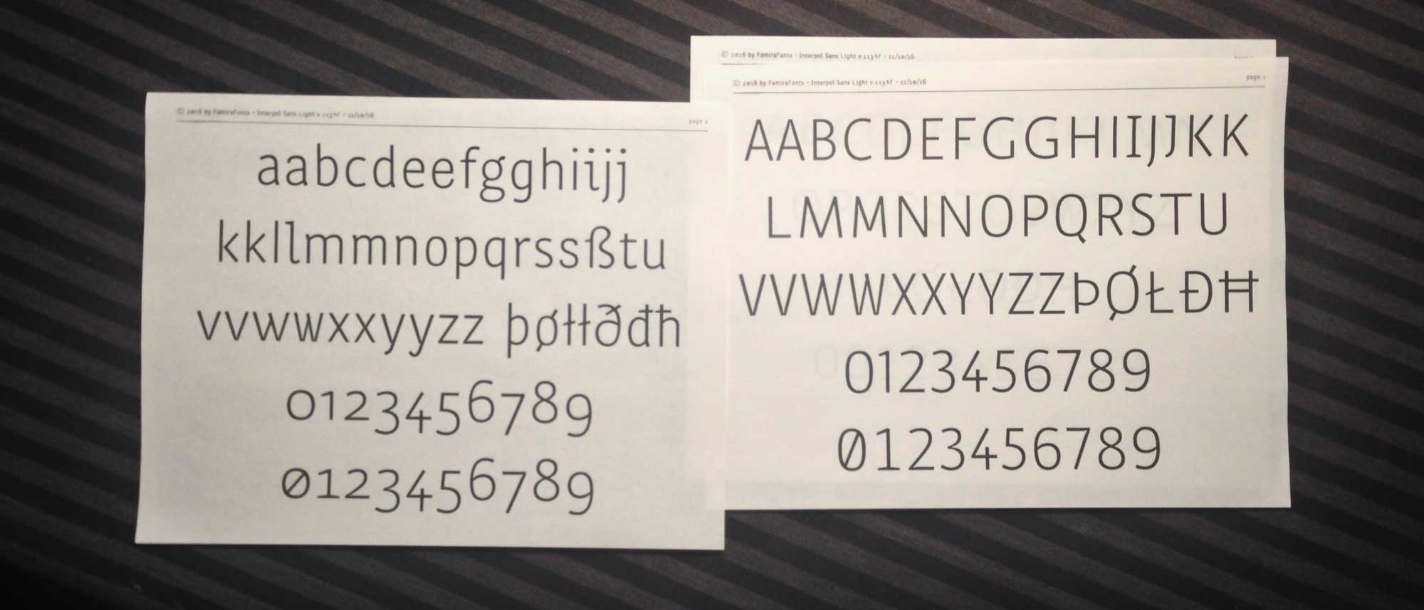
To judge contour quality and stem thickness the first couple of pages show all non-composite glyphs in large size, filling 3 or 4 rows per page. Keep upper and lower case characters and figures on a separate pages but in the same type size. Then show upper case and lower case together on one page (so half the text text size). As the typeface grows add pages showing punctuation, diacritics, math characters etc.Accent placement and alignment
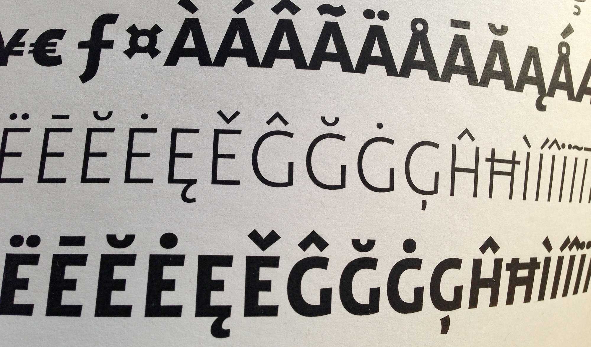
Large text size like the deck in a publication is perfect for showing all composite characters (ö, ò, ó, õ…). This page serves two purposes, to study how the diacritics interact with each other but also how they are placed on top of their respective base characters.Rhythm – spacing strings
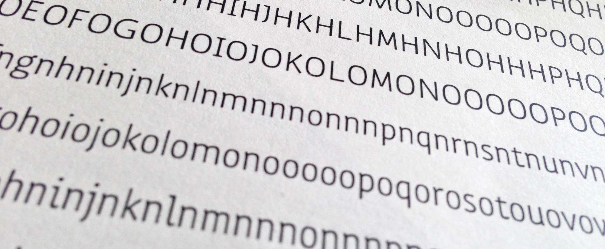
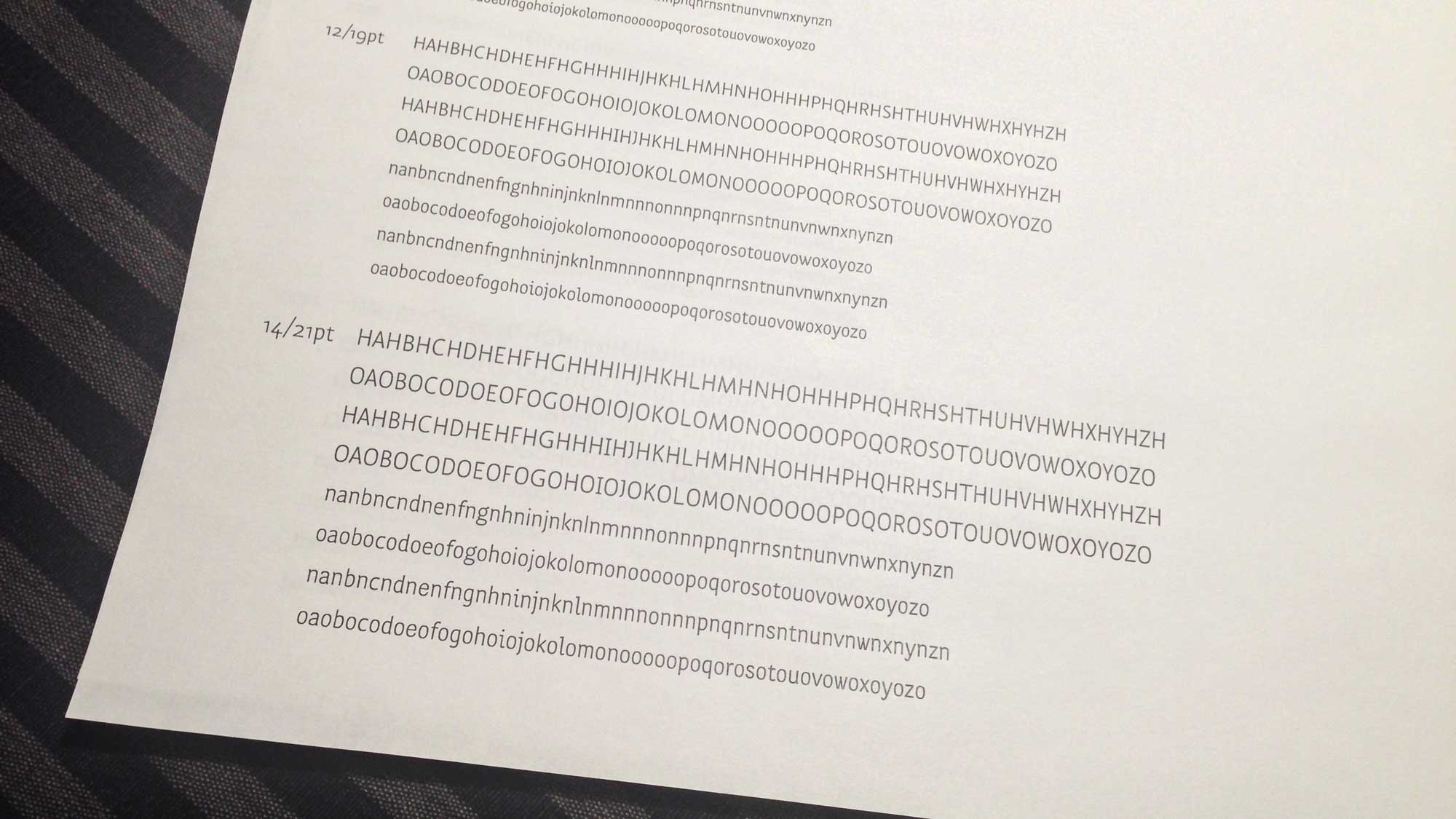
Drawing and spacing are integrated processes. As soon as you start drawing a character make sure the spacing is right. If you wait until the alphabet is drawn before you start spacing you will discover that you created a beautiful set of egocentrics rather than team mates because letters only work when they work together. The rhythm of alternating form and counter form, created by the vertical strokes, counters and letter spaces is what creates legibility. To determine the optimal spacing of every letter that will result in an even rhythm, start with the control characters o and n. In a range of text sizes 10, 12, 14 and 16pt show a string that alternates the control characters as individuals but also in groups (ooonoonnonnn). This way it is easier to sense the distinct rhythms created by each one and compare them. In the end o and n should create the same rhythm. Then, once the control characters are spaced nicely place every new lower case letter and punctuation mark you draw between the o and n (oaobocodoeo… and nanbncndnen…) to determine wether they maintain the rhythm set by the control characters. Then repeat the same with the upper case control characters H and O. So first show a string testing the controls (HHHOHHOOHOOO) and then place all upper case letters between them (HAHBHCHDHEH… and OAOBOCODOEO…).Rhythm – text
The ultimate spacing test of course is to see how a typeface performs in real text in a pleasant to read text size and a line length that measures about two alphabets including word spaces. Every language has a different frequency of individual letters and typical sequences that return forming a distinct texture. A paragraph of German text, with its high frequency of upper case letters, looks very different from a paragraph of Finnish, which offers a stunning amount of diacritics. By testing your typeface in different languages you will discover different aspects and oddities. So use actual language and no fake or "greek" text and stay away from latin filler, which is offered by some layout applications as a feature but performs poorly for the type designer's needs. Latin, with it's small character set, consisting mainly of vertical strokes just always looks good and omits everything we want to learn about our font.
Rhythm – kerning
Kerning is a fix for specific, unfortunate pairs of character whose combination creates a disruption in text that simply can't be fixed by the most careful spacing. This is why kerning is the final step in font production. To suss out where these rare combinations are hiding place every LC glyph between every LC glyph (aaabacadaea… and then babbbcbdbeb…). Then repeat the same for the entire upper case (AAABACADAEA… and BABBBCBDBEB…) Test the figures between each other, currency symbols, punctuation and math characters (11213141516171819101$1£1¢1€1#1.1,1:1-1+1÷1=1≠1<1>1…). Then finally check the combination of upper case and lower case in a realistic environment, capitalized words (Aardvark Ablution Acrimonious Adventures Aeolian Africa Agamemnon Ahoy Aileron Ajax…)
Intra family consistency
When you design a family of typefaces make sure that you make the same choices for shape, position and width across all styles by running an interleaved comparison. List all glyphs of one style side by side with the same glyphs from the other style. This makes most sense by comparing interpolation masters.Special Symbols
If your typeface contains special symbols (chess pieces, wayfinding symbols, fabric patterns, elements for forms for completion…), use them in text when appropriate in addition to the glyph overview.Specifically for presentations
When you show your typeface in the setting of a classroom critique with a limited timeframe it makes sense to prepare a special version of your proof document. Here are some pointers:- Use landscape orientation for projection
- Every page needs a page header with the following elements: designer name, typeface name, output date, page number
- Keep the page count short. I suggest an eight page maximum
- Show an overview of all styles in the family even if you tried just a couple of characters for a given style
- Show spacing proofs but not kerning proofs
- A whole page of 6pt text does not translate well in projection