.
Feb - 2014
Keiko Titling Pro
→ The ffBlocker™ was released in 1998 and if memory serves it is also the first typeface with clean outlines that I ever drew. It started out actually looking quite differently; Upright, much more bashful in appearance and with a more manifest construction. It took a long time and many, many iterations to arrive at the current form.
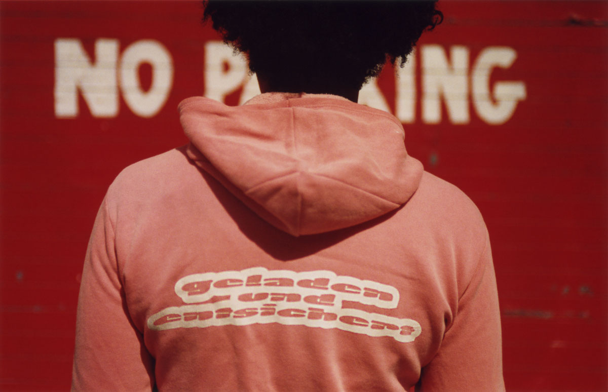
Blocker Hoodie
This photograph is featured in the book Made with FontFont.

The origins
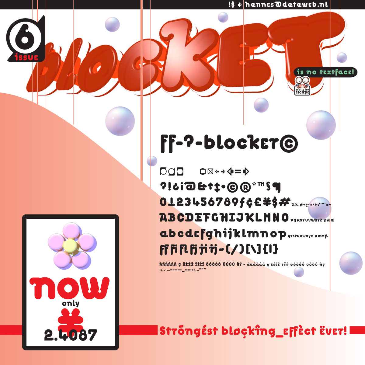
This here below is the oldest document I can find, showing the first iteration of the typeface ffBlocker in use. I designed it ca. 1997 to convince FontShop to publish and distribute my typeface. The design had the size of an LP record sleeve and was laminated between the stiffest, thickest sheets of clear plastic I could find. At the time I was heavily inspired by the packaging from the frozen food section at the Japanese market on my street. Serendipitously, I had a very early 3D rendering program running on my trusty Macintosh ][fx. Strata Vision took a little over one weekend to render the simple, extruded shapes of the big headline pictured below.In this early version of ffBlocker the character design is still strictly geometric. The distinctive shapes, inspired of ink traps are completely circular and there is no slant in the stems at all. All of these typical features changed in the next iteration.

The next step
By adding stress in the verticals and introducing a slight slant I created a subtle thick-thin contrast, infusing the originally quite mechanical looking face with a more humanist aroma. Check out the lower case o to see what I mean; It could easily belong to a much more typographic typeface. At the time I had this vision of a font that would listen to the Prodigy (remember it was the mid nineties...) and maybe make for good titles in Bladerunner II. The secret formula seemed to be to minimize the size of all counters while contrasting ubiquitous round, bubble gum shapes with sparingly applied, distinctive, sharp edges.
ReadMe
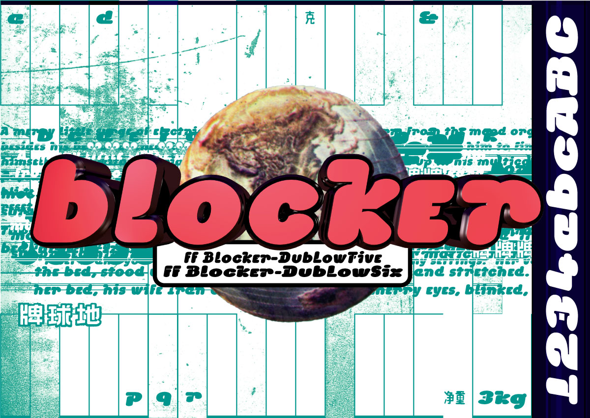
This is the original text for the ReadMe file that went with the release of the ffBlocker™ in 1998.ffBlocker™ is an outrageously arrogant face, literally inflated and with only the slightest trace of historic character shapes. The stereotypes strictly reserved for the aesthetics of the cheap and fantastic. Horror monster, martial arts and action movies come to mind. A sequel to something that wasn't tasteful in the first place. This typeface originally had three weights: "Oldschool", "Vengeful Return" and "Son of the reanimated". The two latter ones were released by FontShop International in 1998 under the names DubLowFive (005) and DubLowSix (006).
Version 2.0 goes by Keiko Titling Pro
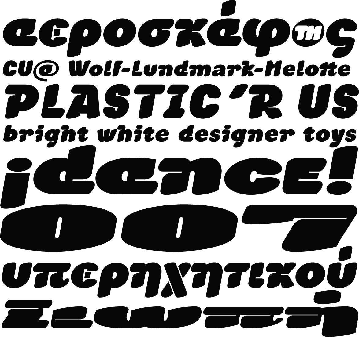
After parting ways with FontShop I have been working on a re-imagined version. I decided to extend the number of optical weights. This includes a lighter, more legible, text oriented style on one end of the spectrum. On the other end I am reaching much farther into the extra heavy, extra wide range of possible letter shapes, up to a deep, iconic display style. This activates much more of the manga potential than the original design. This time I am also going for the full OpenType goodness with greek and cyrillic character sets and plenty of alternative glyphs, expanding the freaky quality of this typeface.Keiko Titling is slated for release in 2014. Also look out for Keiko Text
